12 Fantastic 404 Pages that Convert Lost Visitors
Plus Tips for Building Your Own

To celebrate North Street’s 12th anniversary, we’re doing a dozen blog posts all around the number 12!
The 404 page, also known as an “error page” or “Page Not Found” page, is an internet staple.
Visitors generally reach this page by entering a web address incorrectly or by trying to load content that has been archived or moved to a different page. Your 404 page catches visitors who click on that broken link so they won’t get bounced off your site or rerouted to a broken page. Nobody wants to land on a 404 page — they’re annoying and unexpected. However, you can’t really avoid them, so it’s always a good idea to have a 404 page to fall back on for your website.
If a visitor reaches your 404 page, the last thing you want them to do is to close out the browser tab and move on. When designed correctly, the 404 page can actually turn a lost visitor into a loyal customer. It’s also an opportunity to have fun with your brand and make a memorable impression. Regardless of industry, a good 404 page should do the following three things:
- Inform the visitor they’ve reached the page in error.
- Provide useful links to other pages on your site: at a minimum, your 404 page should link back to your home page. This is also a chance to drive visitors to top-performing pages or key conversion funnels.
- Connect with your visitor, e.g. by showing a little personality!
Here are 12 examples of some of our favorite 404 pages to inspire you:
1. Blizzard Entertainment

Blizzard Entertainment‘s 404 page features a character lost in an actual blizzard and humor that World of Warcraft fans will appreciate: a friendly murloc greets you to help bring you back home.
2. Disney
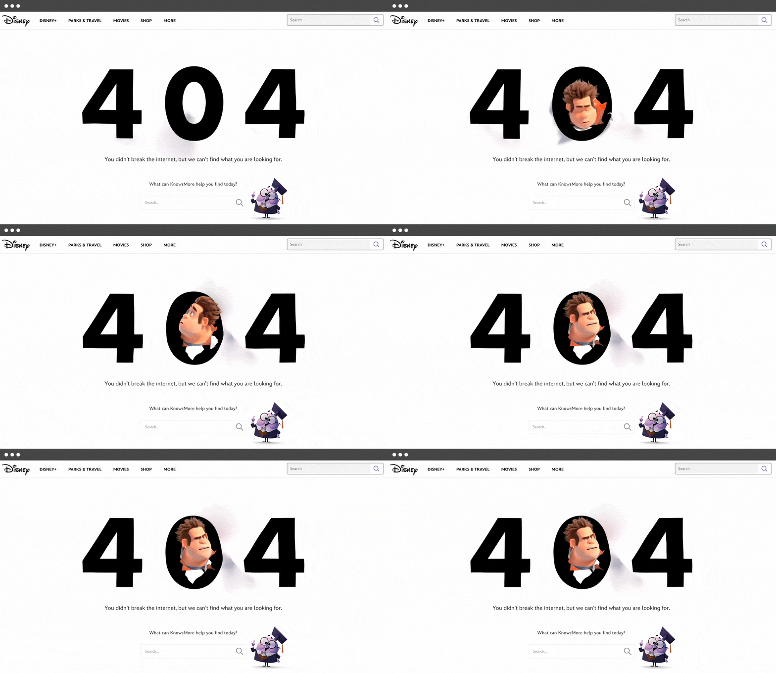
Disney knocks it out of the park with their 404 page by highlighting one of the most popular characters known for destruction – Wreck-it Ralph. They also feature KnowsMore, a side character in Ralph Breaks The Internet. Next to KnowsMore, dead in the center where users will see it, is a little search bar.
3. Dribbble

Dribbble is home to the world’s best design and creative professionals, so it makes sense that its 404 page would be colorful and well-designed. Visitors can scroll to see designs in different hex colors or search for specific content.
4. Eva Habermann

This is a fantastic example of tailoring your 404 page to your industry. The error page on actress Eva Habermann’s website is pure drama: there’s no header, just a black background, photo, and a straightforward statement that “you broke Eva.”
5. Headspace

Guided meditation app Headspace ingeniously incorporates its brand messaging into its 404 page by making an effort to calm users. It encourages visitors to take a deep breath before returning to the main site.
6. Ikea
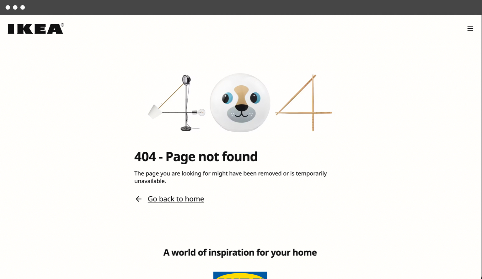
Ikea’s 404 page is minimalist but manages to sneak some clever branding in there. This example shows that your error pages don’t need to be elaborate to get the point across. And there’s nothing wrong with injecting some fun, either!
7. KonMari

Known for her popular cleaning and organization brand, Marie Kondo has brought a similar feel to her KonMari website’s 404 page. The copy briefly and humorously harkens back to her tidying philosophy — a small but well-branded detail that fans will recognize.
8. The New Yorker
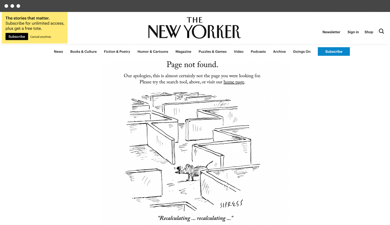
American magazine The New Yorker is known for its excellent cartoons. So, of course, they have one that works perfectly for an error page.
9. p3

p3 is a team of content creators producing original scripted, documentary, and animation work. North Street designed p3’s 404 page around a fun and compelling video, allowing the agency’s personality to shine through.
10. Patagonia
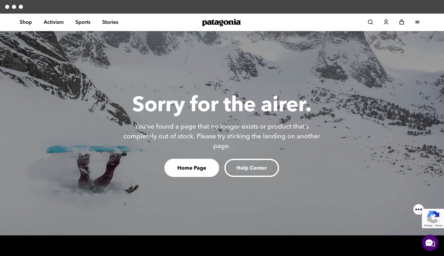
Patagonia’s 404 page captures the brand’s vibe perfectly, complete with a crashing snowboarder, a clever error/airer pun, and prominent links to key pages. It’s a fun and friendly way to greet visitors who wound up in the wrong place.
11. Pixar
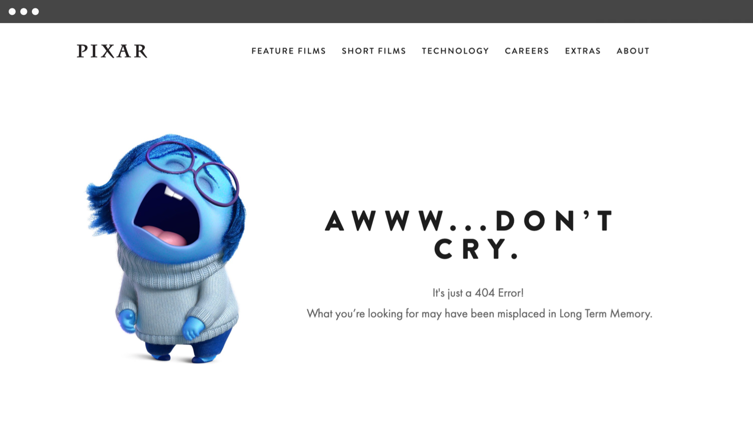
Animated film giant Pixar has one of the most on-brand 404 pages. Sadness (a character from their hit movie Inside Out) is used to explain the error message using concepts straight from the film.
12. Steve Lambert

Artist and activist Steve Lambert has created the world’s most awkward 404 page. This is, without question, a North Street favorite.
Bonus: North Street

What can we say…we are fans of our own. Should they wish, visitors to the North Street 404 page can play a game of Asteroids before being transported home. So what are you still doing here?

About north street
We engineer the thoughtful transformation of great organizations. Our proven process helps us understand what your competitors are doing right — and wrong. Want to learn more? Let’s chat.


