Color Study: The Construction Sector

By Dahlia Lilleslatten, Communications
Recently, in performing some competitive research for a couple of construction firms we’re currently rebranding, our design team started to notice some familiar color patterns appearing over and over again. That inspired us to conduct a color study of the industry. We surveyed the websites and brands of the top 100 construction firms to rank the most popular colors in use. Here’s what we found, along with some analysis on what these firms might be trying to convey with their preferred Pantones.
#1: Blues
Wow. A whopping 32% of the top 100 construction companies choose blues as the dominant color for their website or brand identity. And, it’s worth noting that the majority of those firms circulate around essentially the same shade of muted blue, too.
Blues connote a sense of professionalism, trust, and stability, so it makes sense that they’d be the go-to color choice for an industry that tends to value safety above all else.
#2: Reds
Reds came in second place with 17% of the top 100 construction brands and websites opting for this fiery hue, which is often associated with power and a drive to succeed.
Reds communicate passion, excitement, and exhilaration. They’ve also played a timeless role in the history of architecture and design. Coincidence? Maybe…
#3: Greens
13% of the top 100 construction firms paint themselves with a green brush, which may be an attempt to indicate a push towards sustainable and environmentally-conscious building practices.
As more construction companies implement energy-efficient practices and solutions, we’re likely to see more green branding in the industry going forward.
#4: Black
Subtle, sophisticated, and bold, black was chosen by 8% of the top construction companies.
When executed correctly, black is crisp and elegant, with a distinctly clean and powerful feeling. But, be careful. If it isn’t executed perfectly, black can also come off as sterile—or, worse—negative.
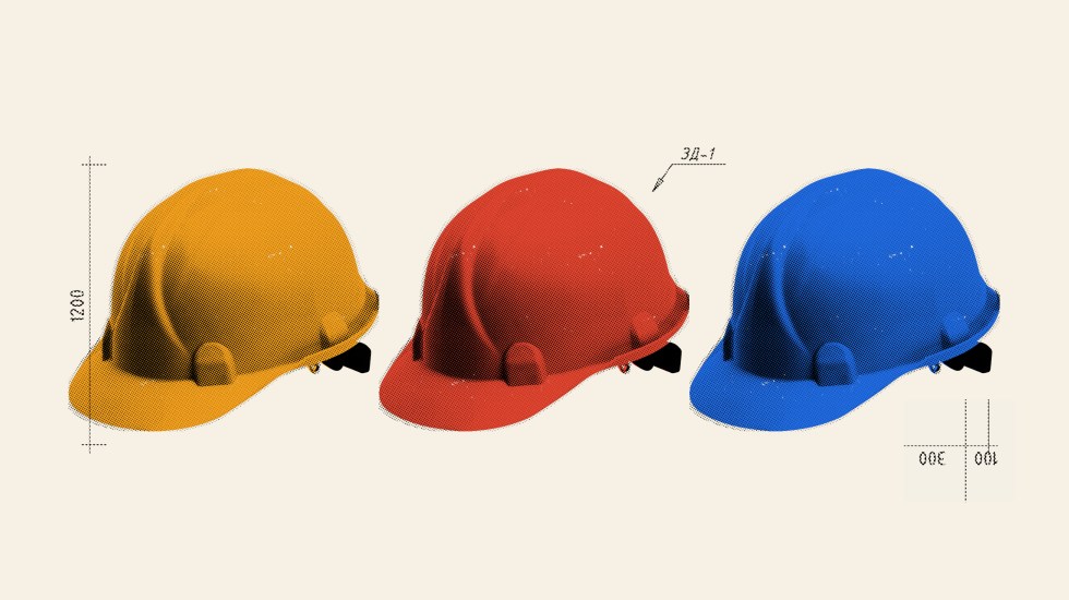
#5: Oranges/Yellows
Oranges and yellows both tied at 4% in our color study. With yellow hard hats, orange safety cones, and orange/yellow warning signs dominating most construction sites, perhaps these colors were just the natural go-to’s for this small segment of the top 100.
If you’re interested in a deeper dive on color psychology, check out our article on the meaning of colors and shapes in branding.

About north street
We engineer the thoughtful transformation of great organizations. Our proven process helps us understand what your competitors are doing right — and wrong. Want to learn more? Let’s chat.