Fonts We Love – Chapter 1 of a Zillion

By Dahlia Lilleslatten, Communications
Great typography is the beating heart of design and branding. Sorry, did we come on too strong there? We’re font geeks. Can you blame us? It is after all, the painstaking and scientific choice of fonts that brings brands, websites, ads, and movie titles to life. So, just for fun, we asked the team to share their favorite fonts and what makes them so special.
Tom Conlon, Founder + CEO
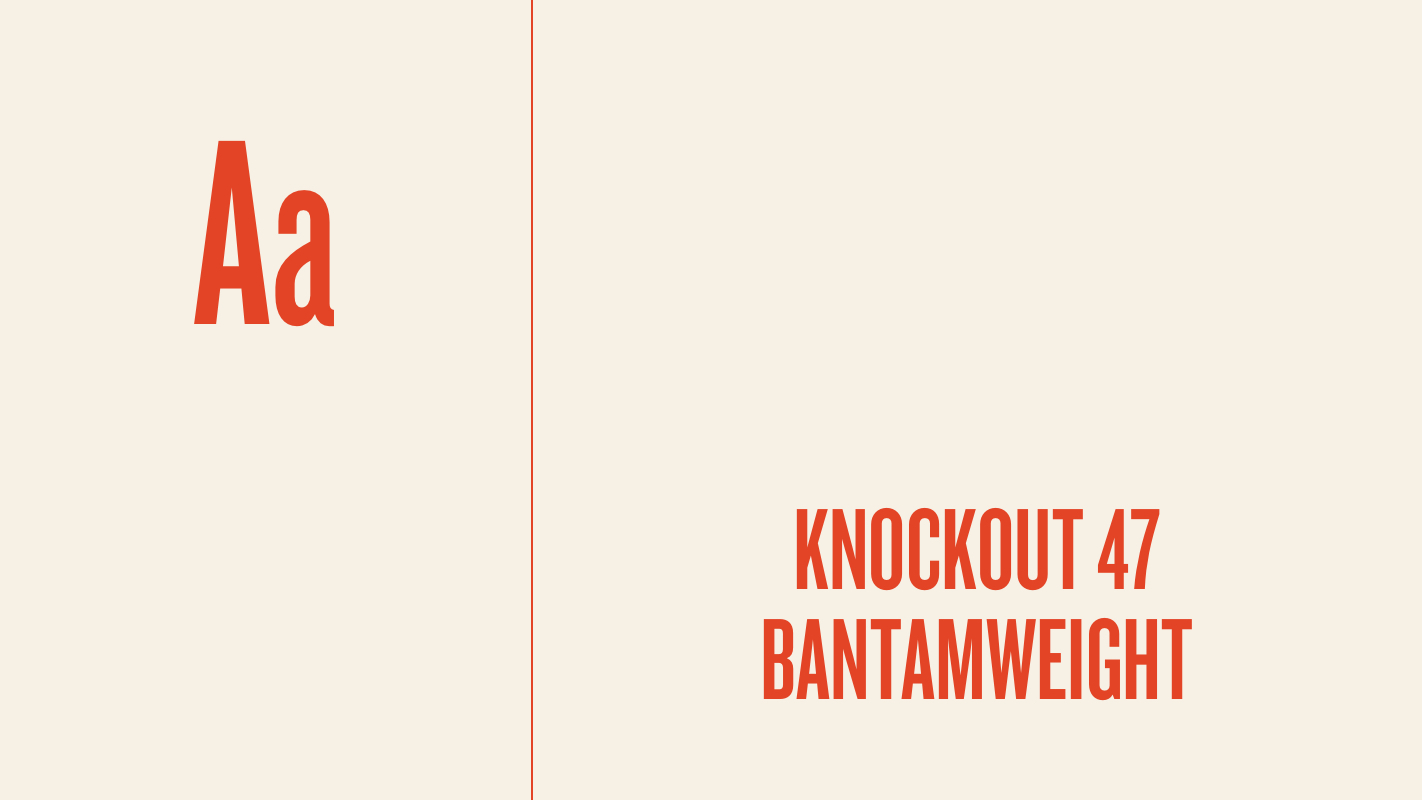
Knockout My all-time fave is Knockout 47 Bantamweight by Hoefler&Co. (designed back when they were still Hoefler & Frere Jones). It’s tall, epic, powerful, and undeniably perfect for headlines and logos. The image of the vintage wooden North Street sign on our website is the original North Street logo I designed back in 2010 using Knockout for “North Street.” But it only works in ALL CAPS. Knockout in title case or lowercase makes me queasy.
Sean Tice, Creative Director
(NB: Sean cheated and could only narrow it down to 3 top picks)
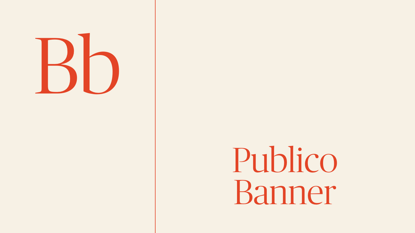
Publico Banner This serif font was created for magazine designers in 2011. Despite its origin — or maybe because of it — Publico Banner looks really good on a screen. Elegant yet authoritative, both the heavy and lighter weights work equally well for jumbo headlines.
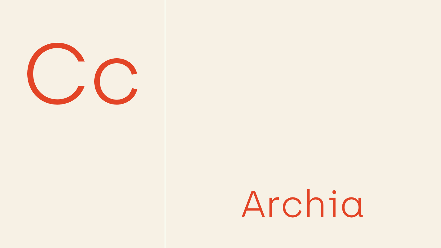
Archia The folks at atipo foundry are creating some really great fonts on a “pay what you want” model. Archia is one of my favorites from them — it’s geometric and has a “tech” feel to it, but I find it to be surprisingly versatile.
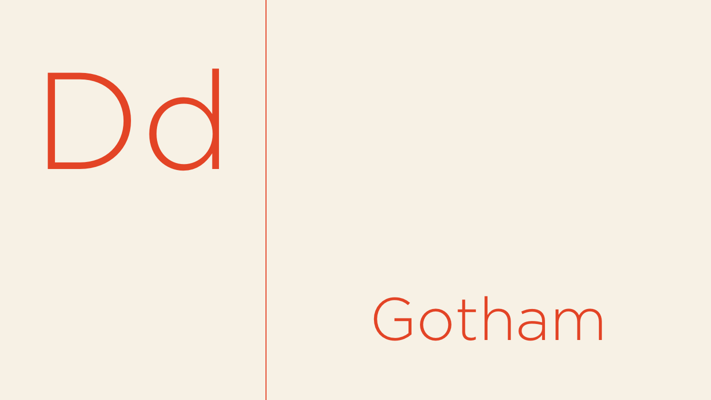
Gotham Okay, so Gotham’s been a bit overused since it hit the big time as the Obama campaign’s typeface of choice in 2008. But, it’s a font that all fonts should strive to be — clean, balanced, and premium in appearance while being totally accessible. I don’t use Gotham much these days, but it has many of the qualities I look for when making font selections.
Sarah Love, Senior Designer
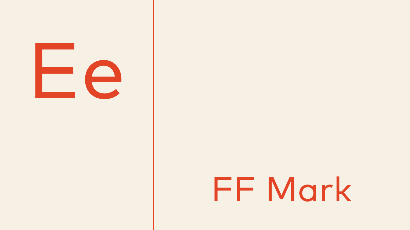
FF Mark It’s a super clean, simple, and modern font. I love its precise geometric curves and large x-height, making it super versatile no matter what size or scale. Its wide range of weights (hairline to black) makes it a one-font-fits-all. Best of all, it can pair nicely with a playful serif font (like Noe Display) to help create warmth and appear more inviting.
Ivan Orellana, Production + Growth Coordinator
I’m torn between Papyrus or Comic Sans.
(NB: For the sake of your eyeballs and the sanctity of this website, we’ve omitted images of these fonts. Sorry, Ivan! But, check out this hysterical mashup.)
Lauren Adams, Visual Designer
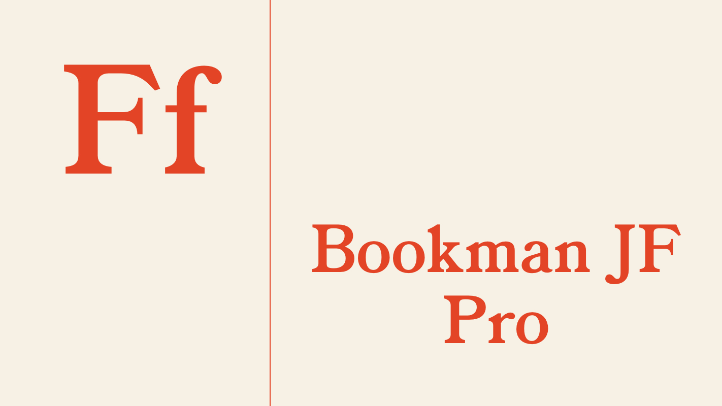
Bookman JF Pro This has been one of my faves since moving to New York City and seeing it on shopping bags and sweatshirts! It’s classic and timeless, while also being fun and distinct.
Dave Moran, Managing Developer
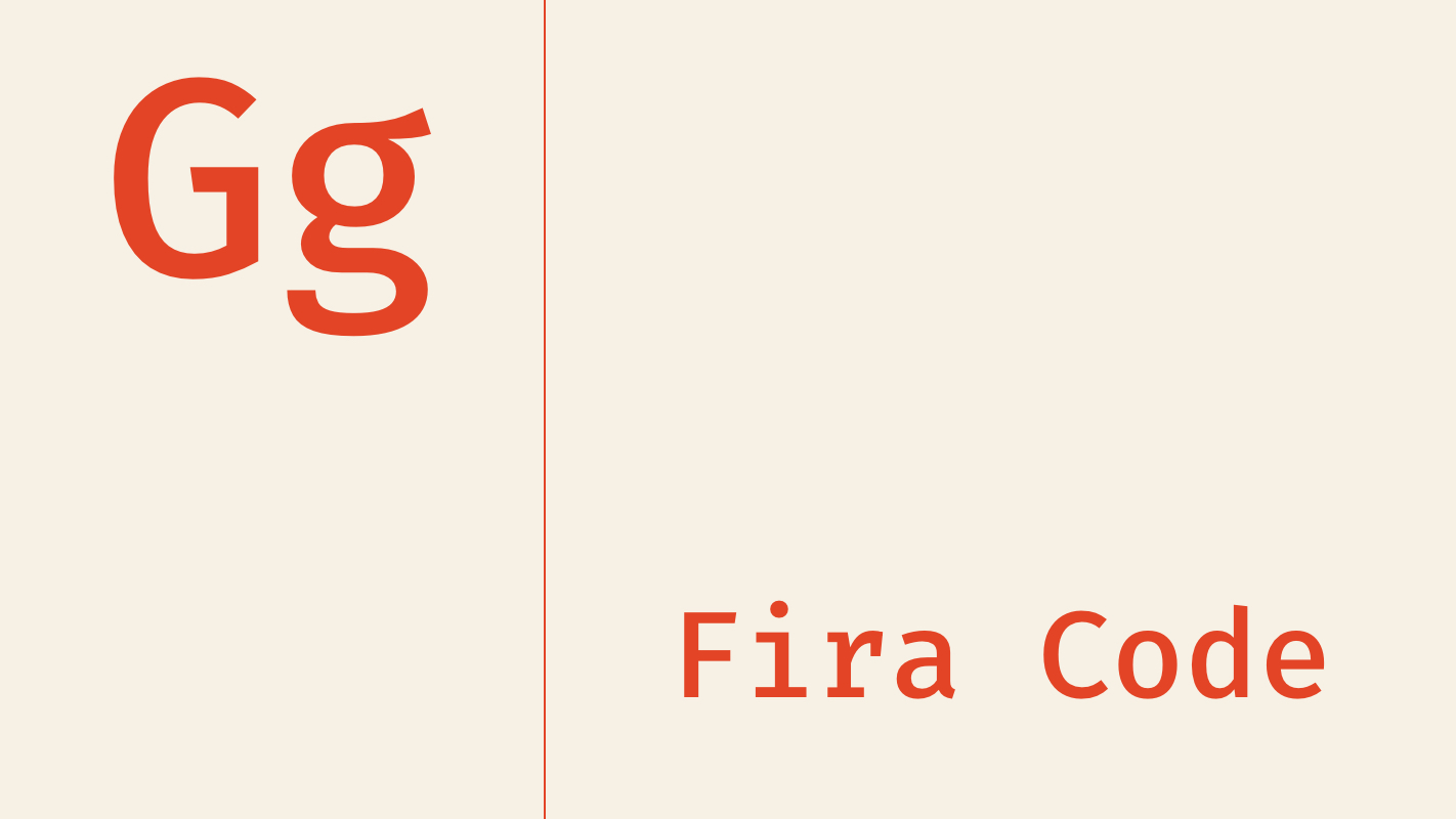
Fira Code This is an easy one for me. If I switch computers, I always make sure this Finra Code is installed and set up so my text editor can use it. Some people like fonts due to their elegance, some people like their fonts because of the medium they’re displayed on (i.e., paper vs. digital), but me? It’s all about functionality, and Fira Code has the best ligatures, making code a lot easier to read while skimming through it. It’s also an open-source font, meaning that anyone can suggest changes or updates to the font in case they find a new use for it.
Dahlia Arado, Communications Assistant
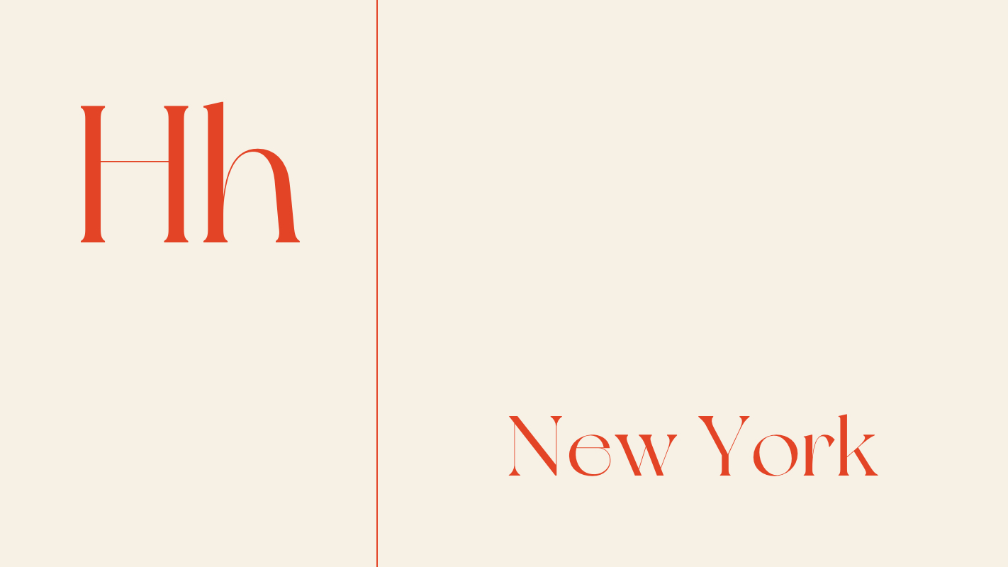
NewYork Ordinarily I gravitate towards sans-serif typefaces due to their versatility and legibility. But the NewYork typeface is too good not to mention. While best used sparingly (think: headers and ornamentation), it combines elegance and sophistication with whimsical curvature and dramatic variations in line thickness.
Greg O’Kane, Production Director
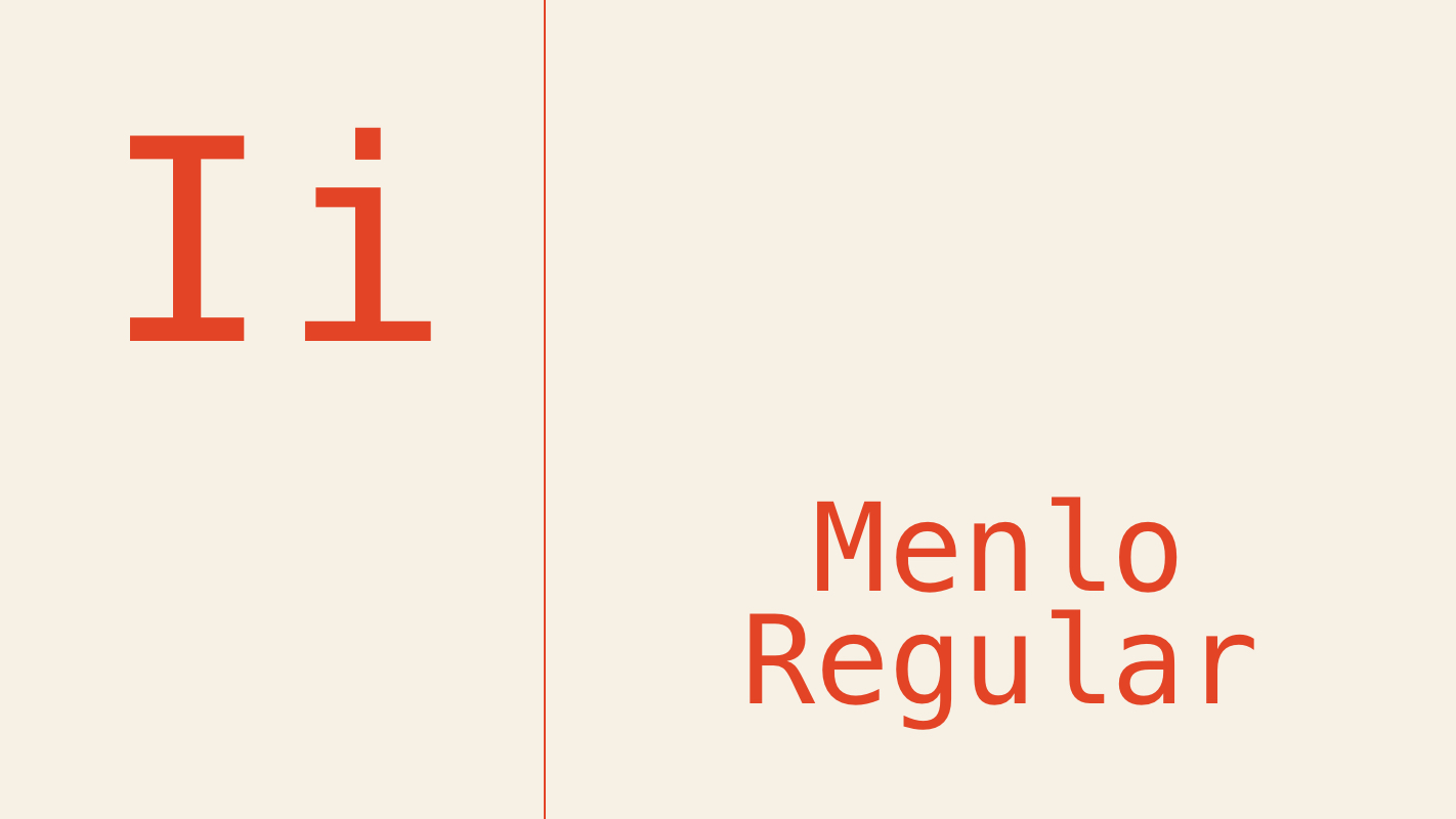
Menlo Regular I’d have to go with Menlo Regular because I spend so much time writing with it. For years I’ve used an application called TextWrangler to organize notes, draft messages, and remove formatting from text in my clipboard before pasting it into a rich text space like an email or a WordPress content editor. Apparently Menlo Regular was the default font in TextWrangler (or I picked it and don’t remember doing so). Either way, it’s been nice to have a neutral, just-the-facts typeface to help me put my thoughts together (including this write-up!) and it’s reminiscent of the years I spent writing code for websites and apps.
John Balnaves, Developer
I don’t really have a favorite font as I don’t look at them in the same way a designer does in my day-to-day role. As a developer, though, I will say any Google font. Why? Because they are free, of decent quality, have an extensive library, and they are super easy to integrate into any build.
Rhona Mae Frasco, Administrative Assistant
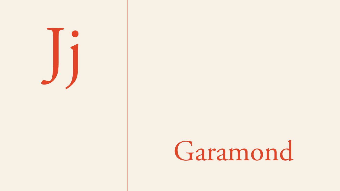
Garamond I find this font very simple and clean. I can remember when I was a student, this is the font style that I usually used for my content writings.
(NB: Props to Rhona for selecting Garamond, which is consistently ranked as the one of the most well-liked fonts.)

About north street
We engineer the thoughtful transformation of great organizations. Our proven process helps us understand what your competitors are doing right — and wrong. Want to learn more? Let’s chat.