How Many Versions of My Logo Do I Need? Many.

By North Street, A Creative Studio
Any idea how many variations of your organization’s logo you might need? Potentially quite a few! A thoughtfully designed brand is platform agnostic—meaning that it shines as beautifully on a business card as it does on the web as it does on the side of a building.
To that end, here are the very many different logo formats you may want to have in your branding arsenal.
Primary Lockup
![]()
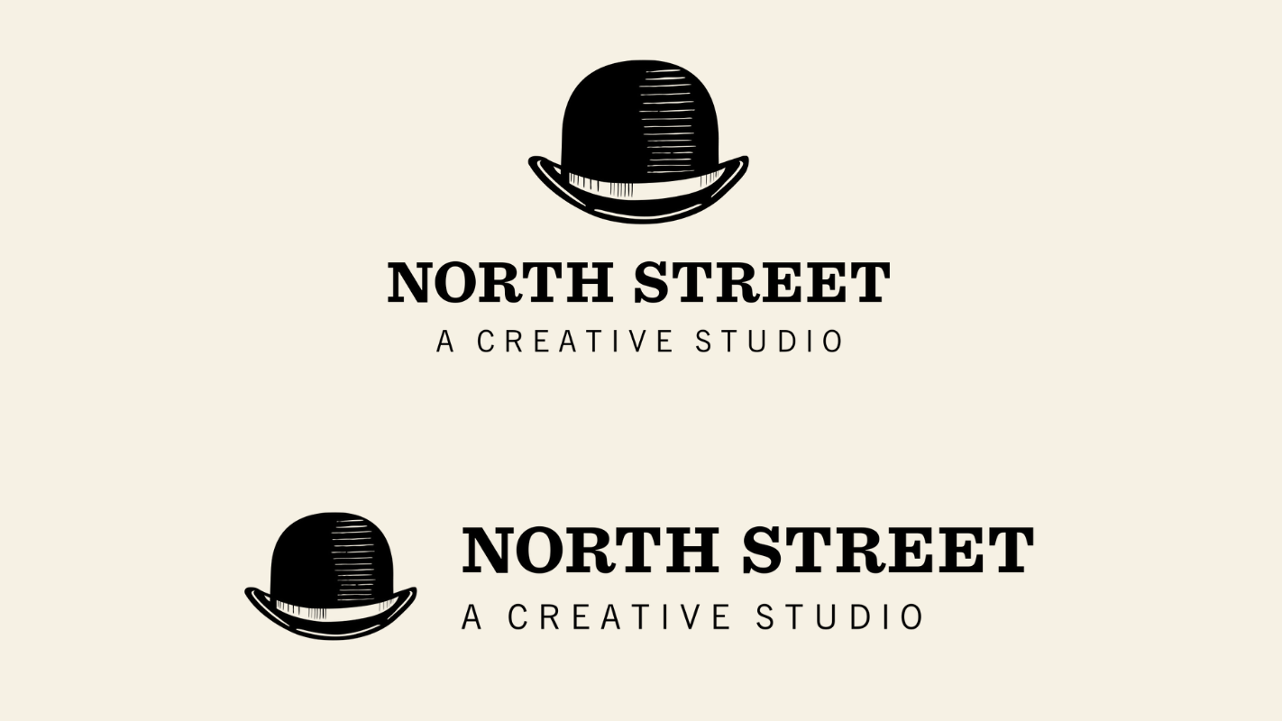
Your primary lockup is the canonical version of your logo—the one you’ll use 90% of the time. The primary logo commonly consists of 1-3 components:
- The mark
- The logotype
- The qualifying strapline
The logotype is the name of your organization displayed in a stylized and likely modified (or even completely custom) typeface. Some brands have only the logotype—it’s the basic minimum unit of a visual brand.
A secondary component of a logo is the mark—an icon or picture that represents your brand in an explicit, metaphorical, or abstract way. A mark can strengthen the impact of the logo and also be used on its own depending on the context. So, for example, you’d likely use the full lockup (logotype and mark) on your website header, business card, and presentation cover slides. But, you’d want to use the mark for social media avatars and app icons. The mark can also be a nice design element that can be used as a watermark or integrated into a pattern. You may also want to switch to either the logotype or the logomark in your website header if you have a “sticky” navigation bar that shrinks in size when the user scrolls.
Another secondary or tertiary component of the primary lockup is a strapline of some kind. This is a succinct line of text underneath the logo where you’d put your slogan, or some qualifying text (i.e., “Attorneys at Law”), or some historical context (i.e., “Established 1950” or “Celebrating 50 Years”). Unlike the logotype or mark, the strapline isn’t typically isolated and used as a design element.
So far, that’s potentially four versions of your logo:
- Full lockup
- Logotype only
- Logomark only
- Logotype and logomark only (no strapline)
But we’re just getting started!
Horizontal/Vertical Alternative
If you’ve got a logomark, it’ll be placed either on top of or to the left of your logotype, meaning that your primary lockup is either vertically or horizontally oriented. But there may be contextual situations where your logo can’t fit comfortably into vertical or horizontal space allotted. So, it’s common to have an alternate version of your logo in the reverse orientation—though, this is more of a thing for vertically-oriented logos that have trouble fitting into website headers.
Trademark
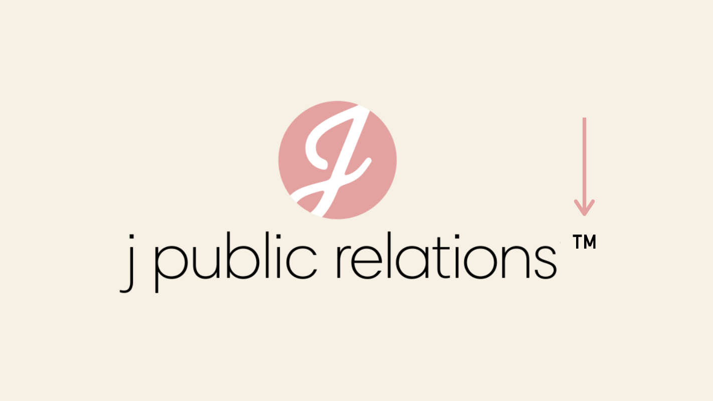
Ever wondered why some logos also include the ® or ™ symbols? Should you be doing this? It depends. The ® symbol is “proof,” if you will, that your logo has been registered and approved by the US Patent and Trademark Office. You have legally protected your logo from being used or badly copied by others.
The ™ symbol is much less official and provides much less legal protection. An organization may choose to use it while seeking approval to use the ® symbol. They may also choose to use it without ever seeking the ® symbol but to demonstrate a history of being first in the market to use the logo.
If you’ve gone through the trouble of getting your logo approved by the USPTO, then it’s a good idea to have your designer provide you a version or your logo that includes it. If you want to protect your logo, but don’t necessarily have the desire or legal ground to earn full ® approval, then you may think about having a ™ version of your logo in your brand guide.
The question is, should you use the trademarked version of your logo everywhere or just in certain contexts? That’s your call. But, I would ask you to consider optics and the fact that you’re a professional organization and not a soda brand.
One more thing of note with regards to trademarked logos: We’re not lawyers. If you’re going to try and trademark your logo or use one of these symbols in your logo lockup, it’d be wise to consult an IP attorney.
Anniversary Alternate
![]()
My, how the time flies! It seems like just yesterday you threw your shingle up—and now here you are 10, 15, 25, 50 years later and still in business. If your firm has some heritage and a long history of success, why not flex that a bit? As mentioned above, this could be as simple as a version of your logo with a “Celebrating 10 years” or “Established 1995” strapline. Or, you may want to go a little further and have a special anniversary logo created.
Color Options
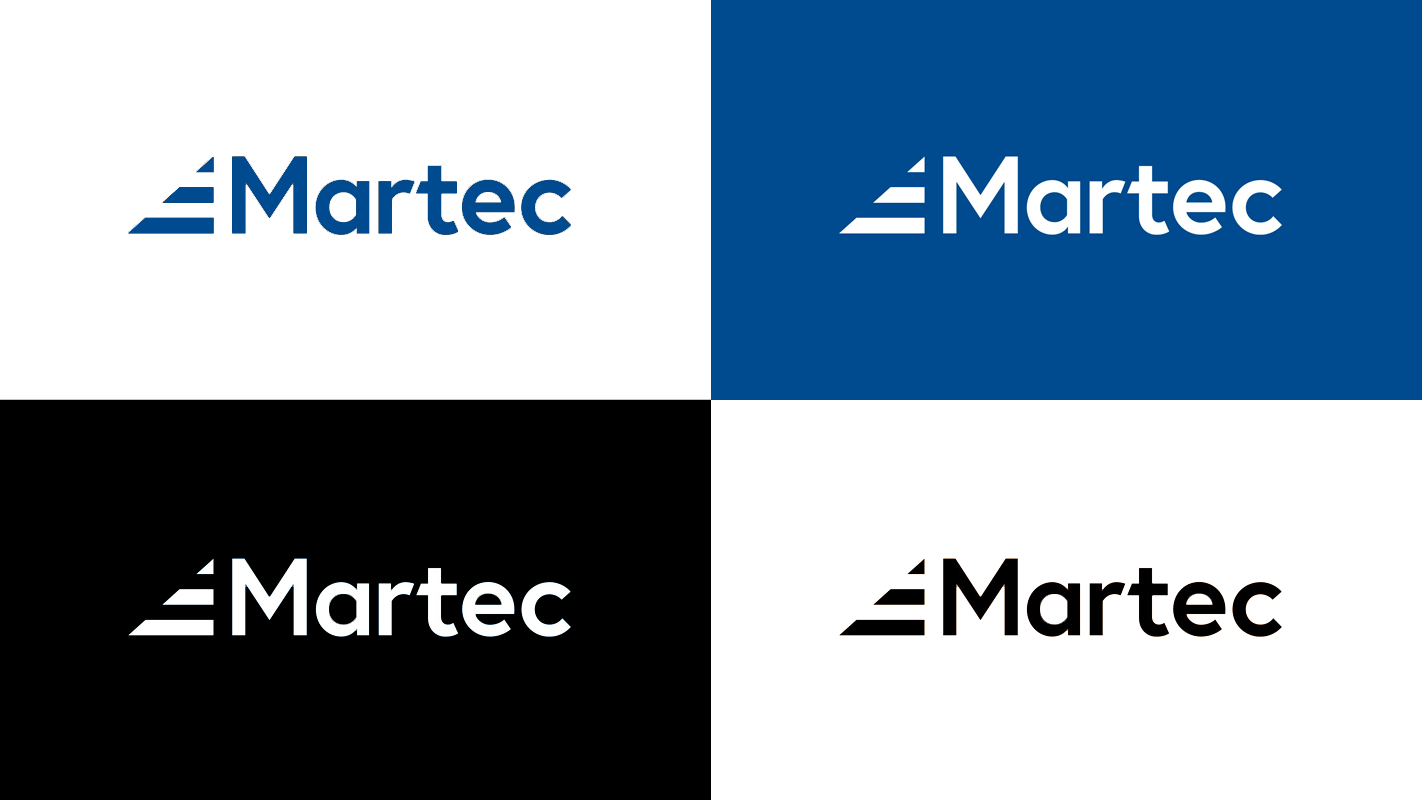
You definitely need a full color version of your logo as well as a one color version for certain uses (black on white). It’s also handy to have a “punched out” or inverted white version of your logo that can be placed on top of different background colors and images.
When it comes to the full-color version of your logo, you’ll want files in two different color profiles for each version of your logo: RGB for web/screen use and CMYK for print use. Don’t get hung up on the alphabet soup—your designer will know what you’re asking for.
File Formats
Your brand guide should include logo files in two formats: raster and vector. Think of the raster files as the production ready versions of your logo—you can put them on a website, upload them to an online profile, and throw them in a PowerPoint presentation. You can use them for business cards and other print uses too if the files are high resolution enough. Common raster formats are .PNG, .GIF, and .JPG.
The vector versions of your logo are more like source files. While they can be used in production in some cases (i.e., websites, business cards), the reason you want vector versions of your logo is because they are easily editable as well as infinitely scalable for large-scale contexts such as billboards, building facades, truck wraps, etc. Common vector formats are .EPS, .AI, and .SVG.
Favicon
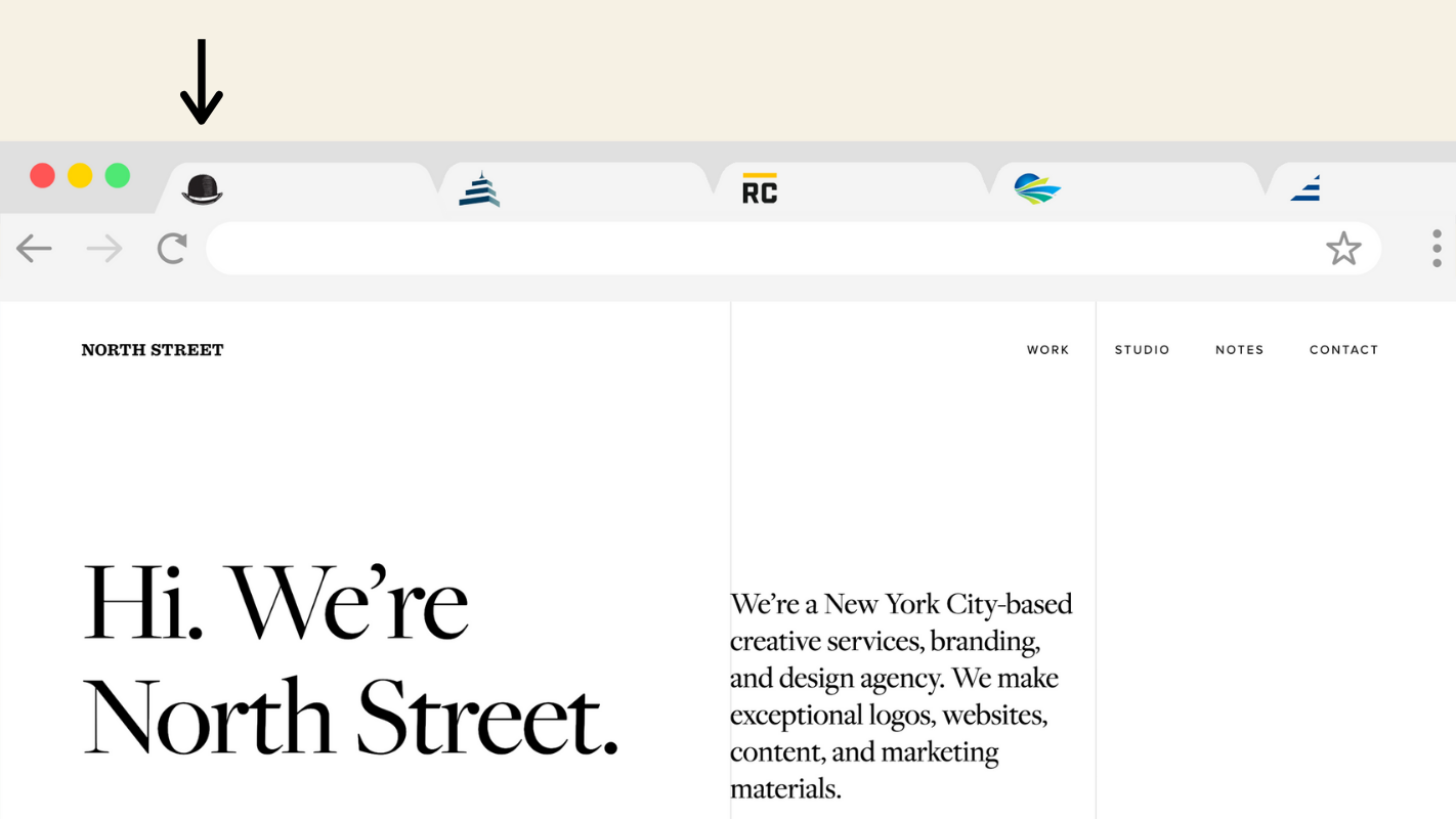
Favicons are the itty bitty versions of your logo that appear in your browser’s tabs and address bar. If you have a logomark, that often does the trick. You’ll need it exported as a 192 pixel square .PNG file. But, if your mark has too much detail, then it’s possible it’ll just look like pixel soup when shrunk down for the browser tab. If that’s the case, you’ll need your designer to remove some of the detail or supply something else simple and readable that represents your brand.
Still with me? Right on! You have officially completed our crash course on logo variations. Go, you!

About north street
We engineer the thoughtful transformation of great organizations. Our proven process helps us understand what your competitors are doing right — and wrong. Want to learn more? Let’s chat.