Logo Design on the 2020 Campaign Trail

By North Street, A Creative Studio
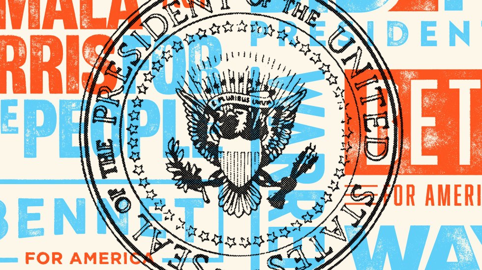
This post is part of our Typeface the Nation series: a nonpartisan look at the design thinking behind the 2020 presidential candidates and their campaigns.
Historically, presidential campaign logos have reflected the prevailing design style of their time.
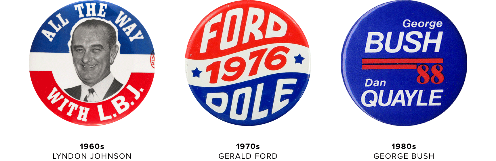
Barack Obama’s 2008 campaign was the first to break this mold. The campaign’s visual identity did more than just declare the candidate’s name and slogan: it demonstrated that a logo can be both refreshingly different and embody a candidate’s platform.
Fast forward to today and this is the new norm for campaign branding. Today’s logos no longer reflect one particular design trend but rather a broader design philosophy that thoughtful design can help a candidate resonate with voters.
On the eve of the first 2020 Democratic debates, our design team sat down to talk the good, bad, and downright ugly of the candidate logos.
The Good
![]()
Beto O’Rourke
Andres Garcia, Designer (AG): A number of logos this year put us on a first-name basis with candidates, and Beto does this best. The tall condensed type is authoritative like a stop sign, but it uses a contemporary typeface that also feels friendly and approachable.
Sean Tice, Creative Director (ST): The all-caps lettering definitely guarantees immediate recognition from a distance, like on a yard sign, but also looks great on your mobile screen. There’s also something “no-nonsense” about forgoing color altogether — like, “let’s get down to business but look good while we’re doing it.” That’s the logo and O’Rourke’s campaign approach in a nutshell.
![]()
Pete Buttigieg
AG: Buttigieg’s logo is my personal favorite. The shape of the logo serves a dual purpose of representing a historically significant bridge in the candidate’s hometown of South Bend, Indiana, and symbolizing the idea of bridging people and connecting the country.
ST: The approach to the campaign look is much more aligned with a traditional identity system for a brand. The color of the logo changes depending on the application and there are different type treatments that complement the main mark.
![]()
Kamala Harris
ST: The color choices and position of the text — sort of stacked but indented — give this a strong intensity and voice, like a headline. It breaks away from the standard rectangular shape of a logo but still manages to feel balanced, which is always visually appealing in a good logo.
AG: This logo reminds me of a late night talk show logo, which is a good thing! It could easily be a marquee on the facade of a theater, proclaiming Harris’ name and mission.
The Bad
![]()
Bernie Sanders
AG: The Sanders logo shows its age. It’s heavy on played out tropes of campaigns past, like the “toothpaste” stripes (reminiscent of Mitt Romney’s 2012 campaign logo, for which he was derided) and the obvious star in place of a dot on the “i”.
ST: There’s nothing exciting about it, but that may be the point. While poorly executed, I think the campaign wants to use the logo to underscore Sanders’ credibility and experience as a career politician.
![]()
Joe Biden
ST: The Biden logo is heavy. It’s an effective ploy to stand out from the other logos and suggest authority, but doesn’t do much more than that.
AG: Biden’s logo has an expected, business-as-usual look. The striped E is clever, but also makes the logo look stiff and blocky. That’s probably not the best look for a candidate.
![]()
Cory Booker
AG: This logo needs to breathe! The letters and shapes are positioned so tightly together that the logo feels unsettlingly tense. Also, the black on blue is hard on the eyes.
ST: It looks like they were going for symmetry between CORY and 2020, but the year ends up being too big relative to the candidate’s name.
The Ugly
![]()
Andrew Yang
ST: The blue and red treatment is very traditional. This feels more 1999 than 2019, when italicized sans serif text was more in vogue.
AG: There’s a clever attempt to incorporate the American flag but it ends up compromising the legibility of Yang’s name. The Y ends up looking more like a fin or smokestack, which calls to mind an airline or cruise ship company.
![]()
Jay Inslee
AG: This logo is better suited for a corporation than a candidate. The font choice for “Inslee” is very institutional and the gradient on the circle is generic. What’s more, the gradient is limited in its applications — I can’t imagine how this would look on a white background.
ST: It’s unclear what this logo is trying to say. What does “Our Moment” mean? Overall the logo lacks energy and personality.
![]()
Bill de Blasio
ST: The de Blasio logo takes the cake for worst logo of the 2020 campaign. It feels like an afterthought, like the candidate’s team realized they needed a logo at the last minute.
AG: Similar to the Inslee logo, it doesn’t really tell us anything about the candidate. This is better suited for a small town election than the nation’s highest office.

About north street
We engineer the thoughtful transformation of great organizations. Our proven process helps us understand what your competitors are doing right — and wrong. Want to learn more? Let’s chat.