Picking The Right Typeface for the Right Price
On a daily basis, we are surrounded by an overwhelming amount of visual noise. From the ads we encounter on our way to work to the screens we’re glued to throughout the day, we are bombarded by type. Even though we probably don’t notice it, we are profoundly affected by type.

By Sean Tice, Creative Director

When it comes to your organization, your choice of typeface is as much a part of your brand as your logo and messaging. Type does the heavy work. It’s what your customers see and it has the ability to dramatically impact the tone of your brand.
Typography has its own voice, meaning, and perception much like language. Different letters within each font family can convey distinct personalities that can help shape a brand’s narrative. Establishing a correct and consistent typographic tone throughout your brand strengthens the overall narrative and portrayal of who you are.
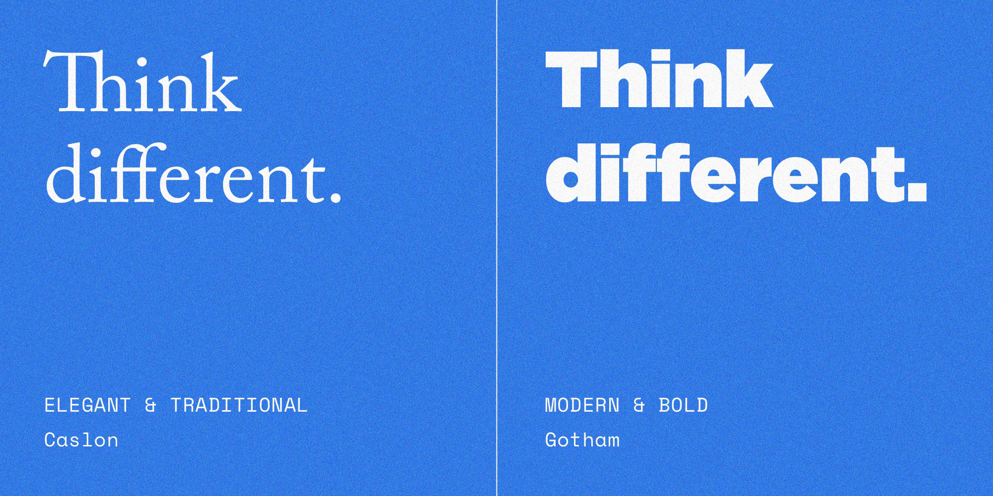
Not all typefaces are made equally. Prices run the gamut from free to thousands of dollars. However, the cost of nailing the right typeface for your company can’t be underestimated. With a seemingly infinite amount of fonts to choose from, how do you know which is the right one for your company? Here’s a quick breakdown on what to expect from different typefaces at different price points.
The Free Options
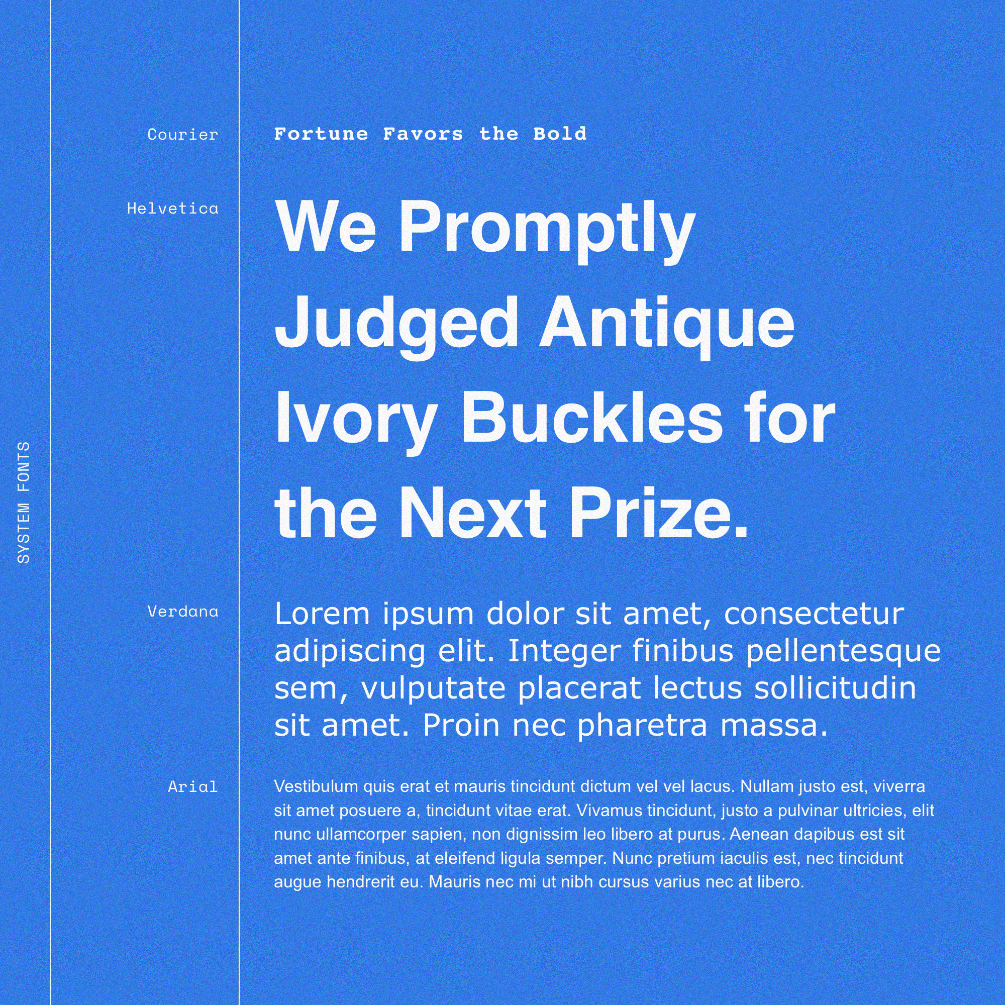
System Fonts
System Fonts are what you get right out of the box with your computer at no additional cost. They’re always going to work with every file you open. Any updates to System Fonts will come through in the operating system, so there’s no need to add items for your “IT To Do” list.
Usually, System Fonts contain nearly all of the characters, accents, and languages you’ll ever need, which is especially important if you’re a global company or brand.
The downside of System Fonts is that everyone has them. They have no real distinguishing characteristics and tend to look generic because they’re everywhere.
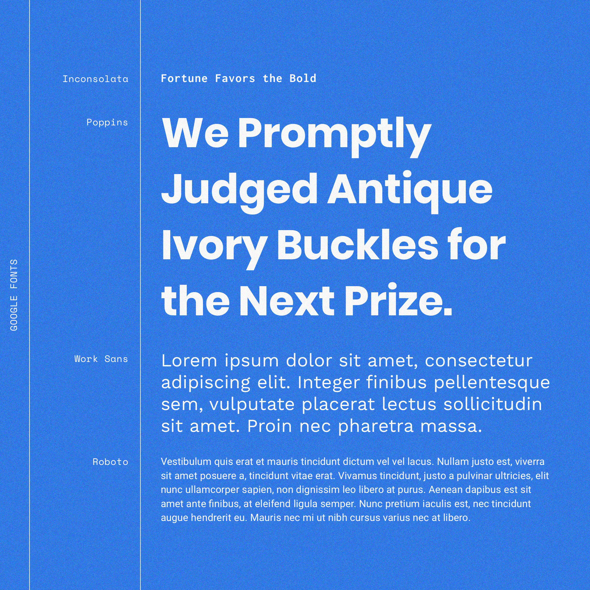
Google Fonts
Google offers free, open source fonts that anyone can download and modify. Compared to System Fonts they can be an amazing resource because there are many more options available. The downside is that you’re going to have to do some digging in order to find the gems.
One thing to be aware of is that Google fonts are mainly designed for your screen and most lack the fine-tuning and attention to detail that is required to make them scale from device to device or from screen to print mediums. They often suffer in quality and can create some consistency and legibility issues down the road.
Sometimes a Google Font will suddenly reach a heightened level of popularity and be used everywhere you look (see: Lobster). Since everybody has access to Google fonts you may run the risk of looking unoriginal. But if you’re willing to hunt, you can definitely find a typeface on Google Fonts that makes your brand stand out.
The Paid Options
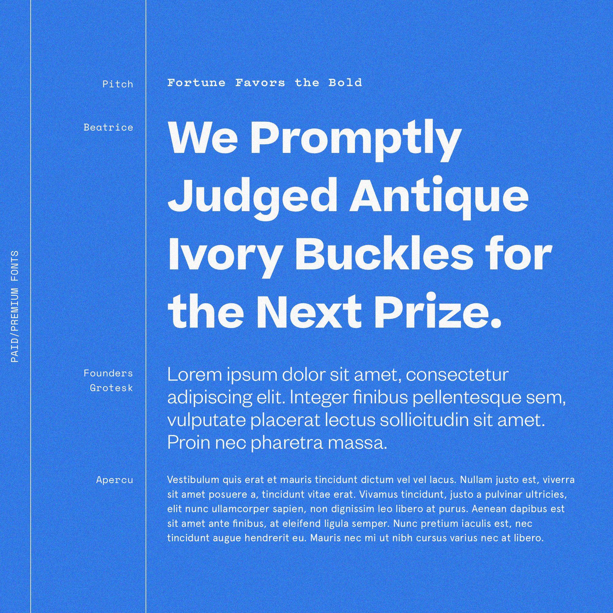
Paid/Premium Fonts
The main difference between Paid or Premium Fonts and System or Google Fonts is obviously the price point. Think of Paid/Premium Fonts like buying whatever automobile works best for you rather than using overcrowded and underserviced public transportation. And just like a car, there are multiple price points because some paid fonts are simply built better than others.
Paid/Premium fonts can get pricey depending on the size of your company and type foundries (companies that design or distribute typefaces) will pursue abuses. Think of all the employees that will be consistently using these fonts. You’re going to need licenses for all of their computers. Those costs begin to add up.
There are a number of advantages to Paid/Premium fonts. They’re tested extensively so they’re as legible on a mobile device as they are on a desktop monitor. They offer more thoughtful letter spacing to further improve legibility. They also offer more characters and accents for different languages, which is critical for companies with multi-language websites.
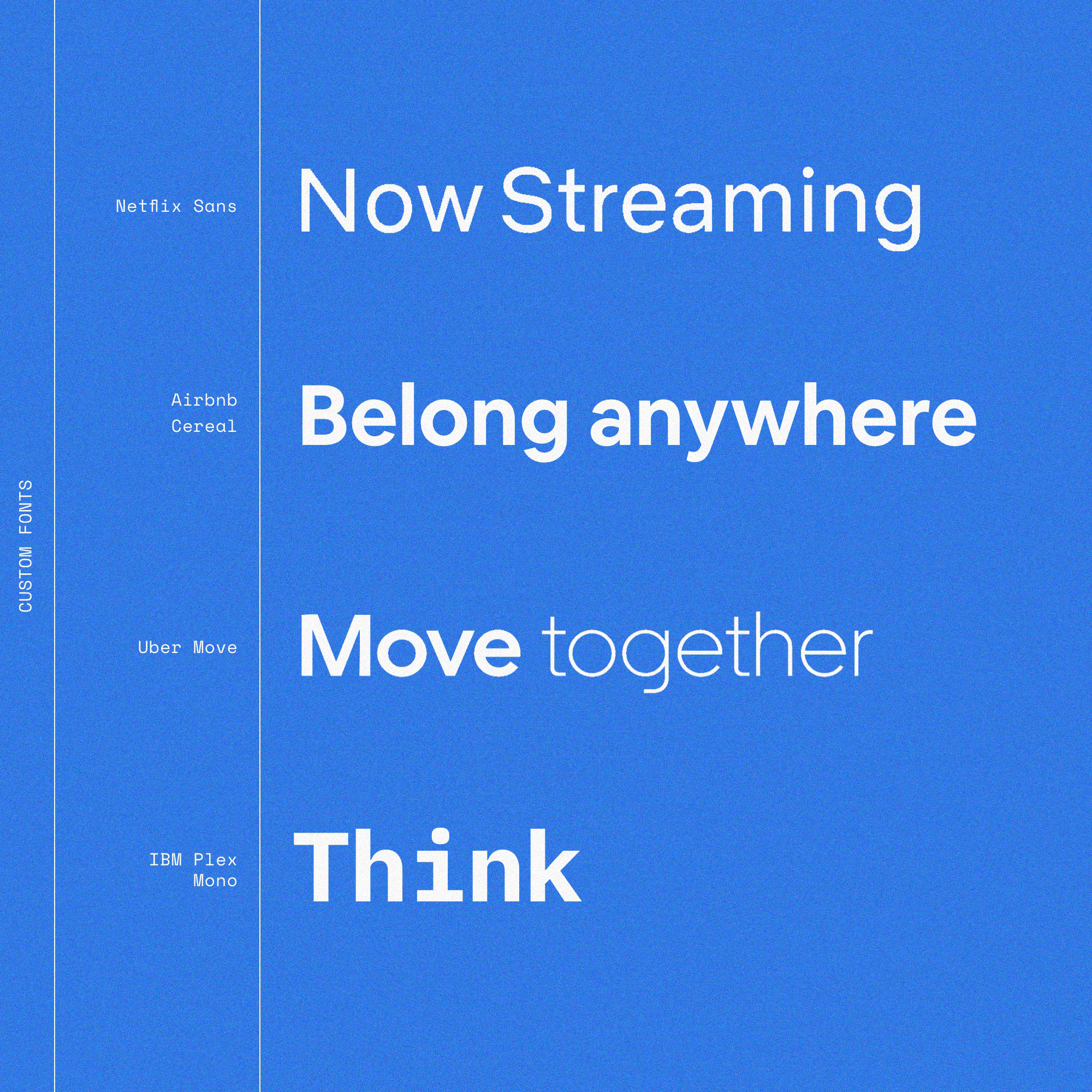
Bespoke/Custom Fonts
Netflix Sans, UPS Sans, Airbnb Cereal, Uber Move, Intel Clear, Nokia Pure. These are all custom typefaces created to be 100% unique to the organization that commissioned them. Bespoke Fonts don’t come cheap but they add significantly more personality to a brand than any of the other options. Plus you’re going to be directly involved in how the font looks and feels.
There’s a certain amount of vanity to choosing a custom font but you’re also getting a completely unique typeface that will only ever be used by your brand. If you’re a mid- or small-sized company trying to stand out from your competition, you can make a strong argument for making an investment in a Bespoke Font. One the one hand, it might be the signifier that your brand has “made it.” On the other hand, Target, American Airlines, Jeep, and Verizon are all doing pretty OK using a using the universally ubiquitous font: Helvetica.

About north street
We engineer the thoughtful transformation of great organizations. Our proven process helps us understand what your competitors are doing right — and wrong. Want to learn more? Let’s chat.