Stock Art Misfires and How to Fix Them (Part 1)

Let me start by saying that there’s some really great, well-shot, stylish, and unique stock art available out there on the Internet. Unfortunately, most of the B2B and professional services sites we come across online aren’t using it. They’re using the bad stuff. The cliche, corny stuff of meme-makers’ dreams.
Don’t underestimate the power of poorly chosen stock art to undermine your brand or the impact of your content. We could design you the world’s most beautiful and celebrated website—a gleaming monument to your brand promise and values—but poor stock art choices could topple the whole thing over. And it’s easy to see why. The imagery on your website and other marketing materials is the visual embodiment of your organization. When you choose images that are contrived, meaningless, or cheesy, what tone do you think that strikes with your audience? Exactly.
Check out our a quick roundup of stock art’s worst offenders. Then be sure to check out Part 2 for our tips on sure-fire stock photo success.
Cliche Symbols

Why They’re Bad
This type of stock art assumes that you and your audience have absolutely no imagination or intelligence, and so it expresses a concept in the most literal terms possible. Puzzle piece = “perfect fit” or “the missing piece.” Bullseye equals “on target” or “exact fit.” A key equals “key to success” or “unlocking success.” A globe equals “global” or “international.” And the worst offender of all, the dreaded “all-in” hands, equals “teamwork.” You get the picture.
Composite Imagery/Symbolism Overload

Why They’re Bad
Take everything that’s bad about the aforementioned cliche images and now double down by mixing them together into an awful collage. These types of composites are a bit of a cheat. The author of the artwork was incapable of capturing one idea in a single visual, and so he or she mashed together various images to synthesize extreme literalism. In this case, it’s “strategy and decisiveness in financial markets.” The image is as generic as the sentiment it expresses. It certainly doesn’t say anything unique or significant about your brand.
Unrealistic & Inauthentic Situations

Why They’re Bad
I’m sorry, but real people just don’t do stuff like this in real life. Photos like this one are inauthentic and awkward at best. They’re what truly give stock photography its bad reputation. If it smells fake, then it is fake. And in the day and age of made-for-Instagram, real, and raw content, posting a photo like this one to a website or feed is practically sacrilege.
“Your Text Here” Props

Why They’re Bad
My problem with the “fill-in-the-blanks” type of image render is that it’s worse than using no image at all. This type of photo couldn’t possibly be more generic and less imaginative. Would any organization or brand on Earth ever deem this type of image to be on brand? Of course not. I think these meaningless stock photo templates exist for one reason and one reason alone: It’s late. You’re on a tight deadline. But your website’s content management system requires you to upload an image for a new blog post. You need something. Anything. However, don’t make this that thing.
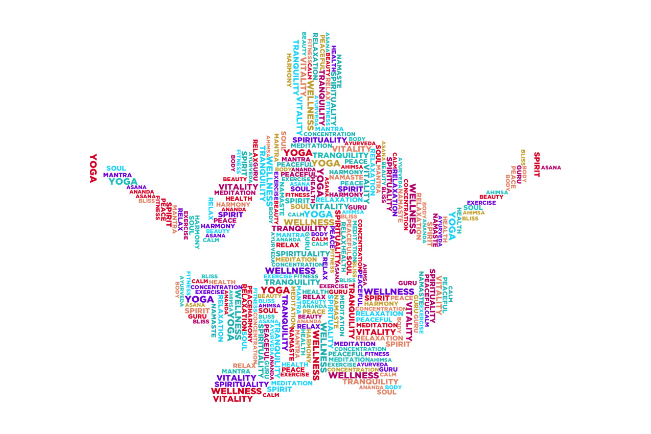
Word and Tag Clouds

Why They’re Bad
The issue with word clouds is that they’re visually overwhelming and actually burden your audience with deciphering the hidden message behind a seemingly random smattering of nouns, verbs, and adjectives. Don’t make your users work for it. Instead, delight them with a passively digestible image that speaks to your brand values while reinforcing the message behind a particular piece of messaging or content.
3D Rendered Figures
![]()
Why They’re Bad
At its core, really great branding is all about making a human connection to your audience’s wants and needs. And so what could possibly be more antithetical to the human connection than these faceless little 3D gnomes? They’re all over the Internet, toiling away in a whitespace workshop trumpeting on megaphones, putting together puzzle pieces, shaking hands, and even sometimes shaking hands on top of interlocking puzzle pieces. They’re cartoonish, unsophisticated, and creepy—sentiments you likely don’t want to be conflated with your organization’s messaging.
Surrealism and Artiness (For Artiness Sake)

Why They’re Bad
These types of stock images take the mistakes made by cliches, unrealistic situations, symbolism overload, and 3D-rendered figures and blend them all into a pastiche of utterly confusing visualizations. Users shouldn’t have to guess at, or worse, feel conflicted about what they’re seeing in your marketing materials. Abstract imagery is powerful when used in context. But an image like this sandwiched in between a word cloud and some chess pieces is going to baffle and alienate.
Now that we’ve covered some of the most reviled stock art no-no’s, let’s take a look at how to use artwork to maximize impact in Part 2.

About north street
We engineer the thoughtful transformation of great organizations. Our proven process helps us understand what your competitors are doing right — and wrong. Want to learn more? Let’s chat.


