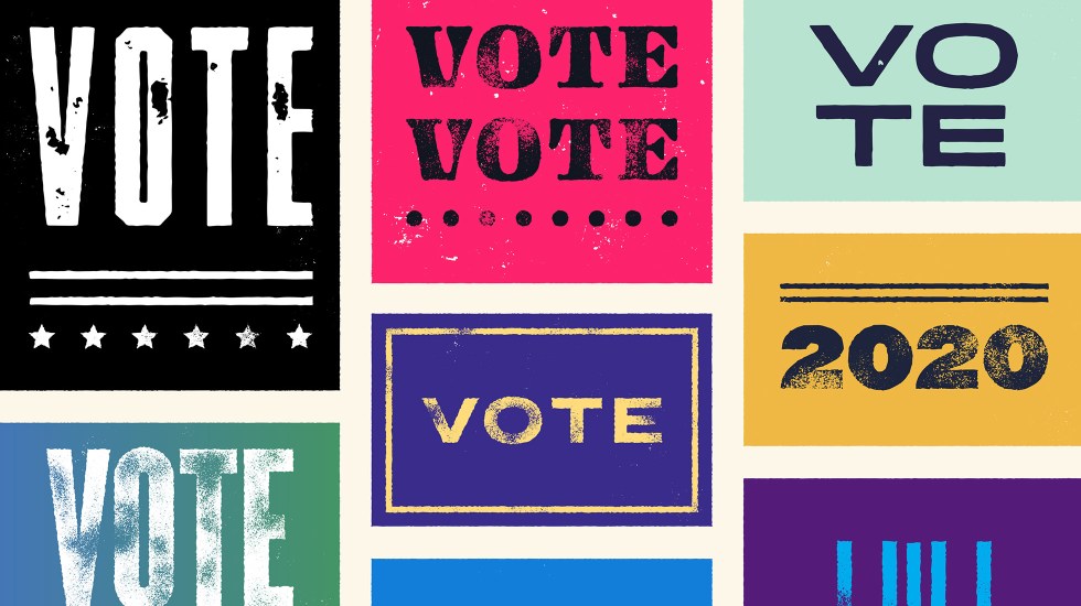
The Meaning Behind 2020 Presidential Campaign Colors

By Sean Tice, Creative Director
This post is part of our Typeface the Nation series: a nonpartisan look at the design thinking behind the 2020 presidential candidates and their campaigns.
First we need to look at why color is so important. Just like your company, presidential campaigns see themselves as a brand. And like a brand, they know they have stiff competition.
By carefully crafting and combining a number of visual elements — including a logo, slogan, typography, and of course color — they have an opportunity to set themselves apart.
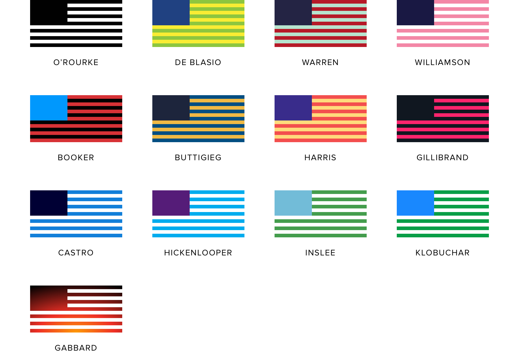
More than half of the 2020 candidates are opting for unconventional and eye-catching color combinations:
What can these color choices tell us about candidates, and how can their design thinking be used by your organization?
1. Bold color choices set a brand apart.
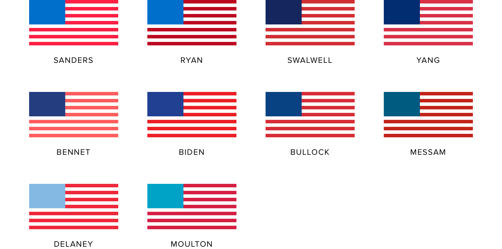
Selecting a color palette that is not commonly associated with your industry or product category can translate to stronger brand recognition. Some are pleasing, some are loud, but none of these get lost in the mix like the traditional red, white, and blue used by the other candidates in this year’s race:
2. The right color combinations work across all marketing touch points.
Today’s campaigns are about more than yard signs and buttons. Think about it: candidates now need to stand out from the fray on an endless number of platforms — social media feeds, your inbox, television — through an endless number of formats — graphics, videos, animations, swag. As a result, campaigns are choosing color combinations that are both visually dynamic and exciting across any number of marketing “touch points.”
3. Color sends a message.
Using specific colors to send a message is nothing new for presidential campaigns — more than 40 years ago Jimmy Carter used green and white to represent his experience as a peanut farmer. But now more than ever, candidates are embracing colors that reflect the issues they care about and values they believe in.
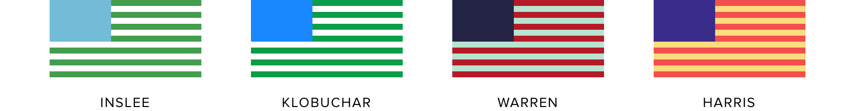
- Jay Inslee and Amy Klobuchar are using greens to represent their focus on climate change policy
- Elizabeth Warren’s self-described “Liberty Green” is inspired by the Statue of Liberty
- Kamala Harris’ color palette is a nod to Shirley Chisholm, the first African American woman elected to Congress
For many of this year’s presidential candidates, patriotism and civic spirit come in more colors than red, white, and blue. Campaigns are making deliberate decisions to introduce bold, exciting colors intended to grab your attention and evoke specific feelings or ideas. What’s more, they’re thinking holistically about how color choices can work across an endless number of marketing touch points. As you think about your own brand colors, consider whether they hit these notes — it’s a seemingly small decision that can have a big impact on your marketing efforts.

About north street
We engineer the thoughtful transformation of great organizations. Our proven process helps us understand what your competitors are doing right — and wrong. Want to learn more? Let’s chat.