12 Factors to Consider When Designing a New Logo
The right brand mark can say everything about your organization without saying a word.

By Sean Tice, Creative Director
To celebrate North Street’s 12th anniversary, we’re doing a dozen blog posts all around the number 12!
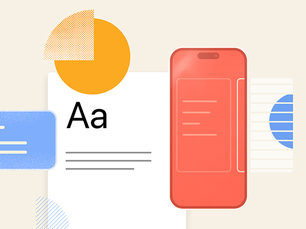
A strong logo is integral to your brand’s success. Often, it’s the first thing people will use to identify your business.
The right brand mark can attract attention from current and potential consumers, connote feelings of trust and excellence, convey brand values, and (perhaps most importantly) inspire loyalty. As such, it is crucial to craft your logo carefully.
Here we will walk you through 12 important factors when designing a new logo.
1. Establish your brand story
While logos signify, brands evoke. Before you even start to think about what your logo can be, you need to establish your brand story.
- What do you do, and who do you do it for?
- What is your competitive advantage, or what distinguishes you from your competitors?
- What feeling or emotion do you want to evoke when a customer encounters your brand?
A meaningful brand story is foundational to drawing customers into your world.
2. Set the scene
Creating a mood board is one of the most effective ways to establish your brand story. Mood boards are collages of inspirational and aspirational images that can be sourced from virtually anywhere. The idea is to focus on the tone you want to set forward, then assemble images that are evocative of that tone.
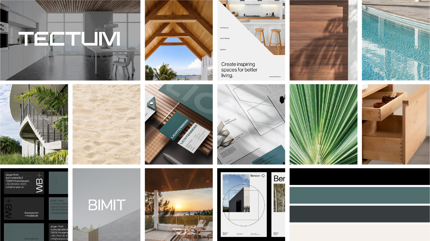
For more guidance on how to create a good mood board, check out our blog post with tips and 12 Mood Board Examples to Inspire Your Rebrand.
3. Consider how your logo fits into your brand story
A logo doesn’t exist in a vacuum – it’s just one piece of your larger brand universe.
When designing a new mark, it’s important to consider how it aligns with and enhances the overall brand identity. Sure, a logo is one of the primary graphic elements that enables people to quickly identify your organization, products, and services. But when combined with the right mix of colors, fonts, textures, images, and copy, your overall brand strategy takes on a level of clarity that can help you effectively communicate your message and reach your audience.
4. Evaluate the competitive landscape
Before designing a new logo, it is essential to understand your competitive landscape — who am I competing with and how do they present themselves?
Creating a collage of competitor logos can help you identify best practices and what to avoid – e.g., most of my competitors use blue, half of them use a thin serif font, etc. This exercise enables you to find any “visual deficiencies” which you can leverage to create a logo that stands out from your competitors.
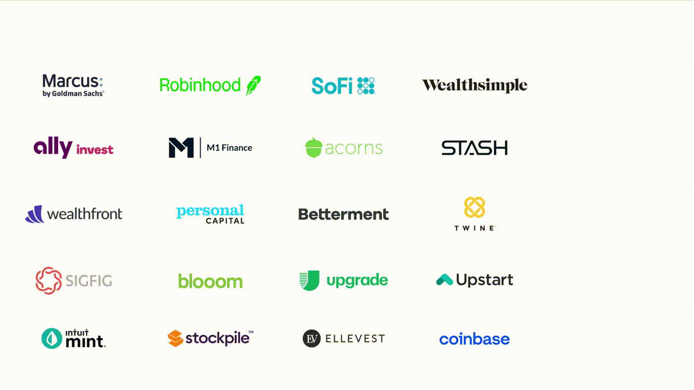
That being said…competitive research gives us the lay of the land and maybe some inspiration, but it’s just additional context. Don’t try to emulate your competition because, for all you know, they are about to roll out a totally new brand themselves.
5. Keep it simple
Remember, the primary purpose of logos is to help people tell organizations apart; to that end, a simple and clean design is more effective than a complex or detailed one.
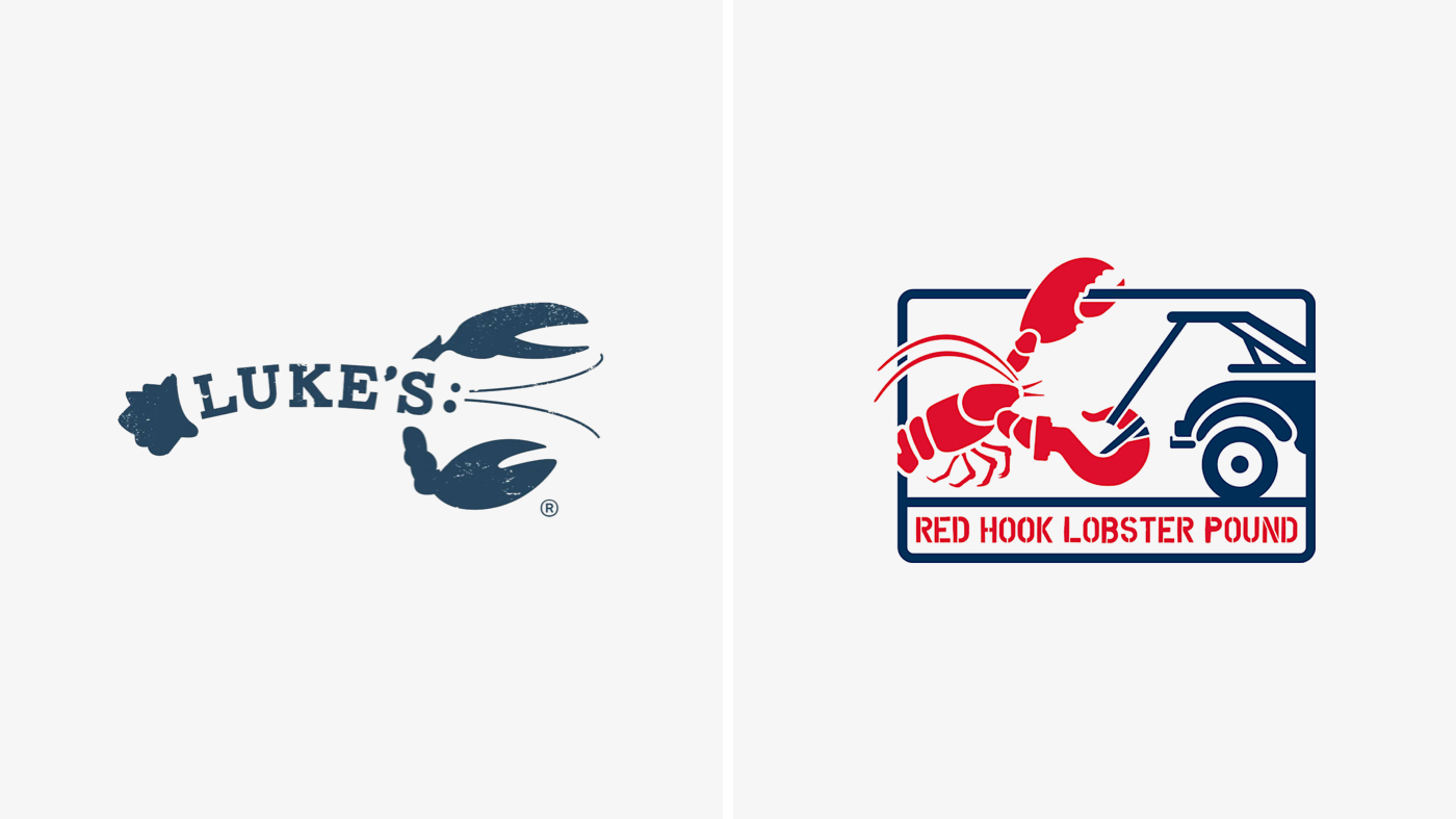
A logo should be easy to read and understand, with minimal elements that are easily recognizable at a glance. The other components of your brand universe (colors, typography, imagery, patterns, messaging) will do the heavy lifting and bring the brand to life.
6. When in doubt, print it out
In addition to your full color logo, you will need a solid color version – what we refer to as a “one color logo.” Logos are sometimes used in non-conventional ways (e.g. laser engravings, embroidery, sponsorship limitations) that don’t support ordinary colored files. This is where monochrome formats come into play. This means no gradients, shading, or multiple colors butting up against or overlapping each other.
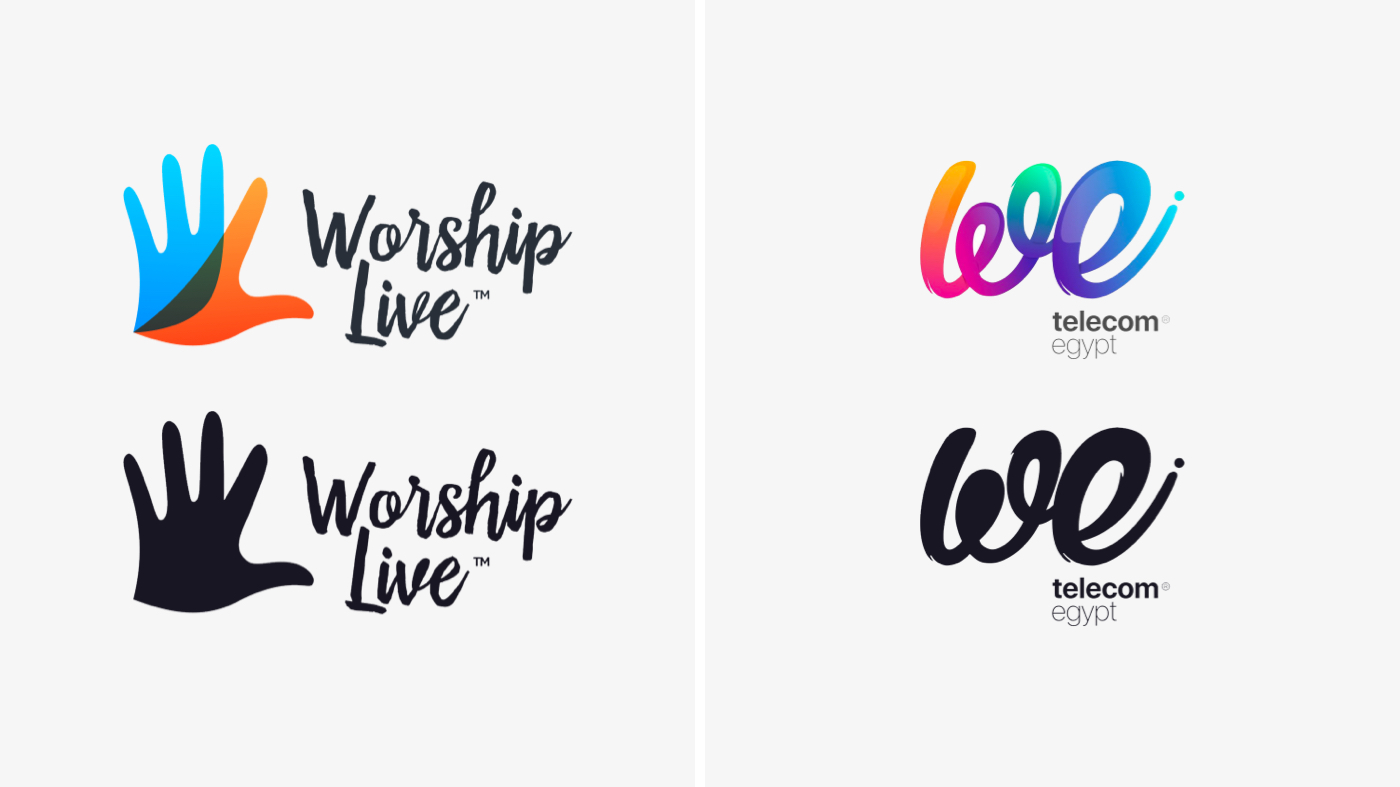
A simple test is to design your logo in one color and print it on a black-and-white printer. If it reads, then you’re ready to start adding color.
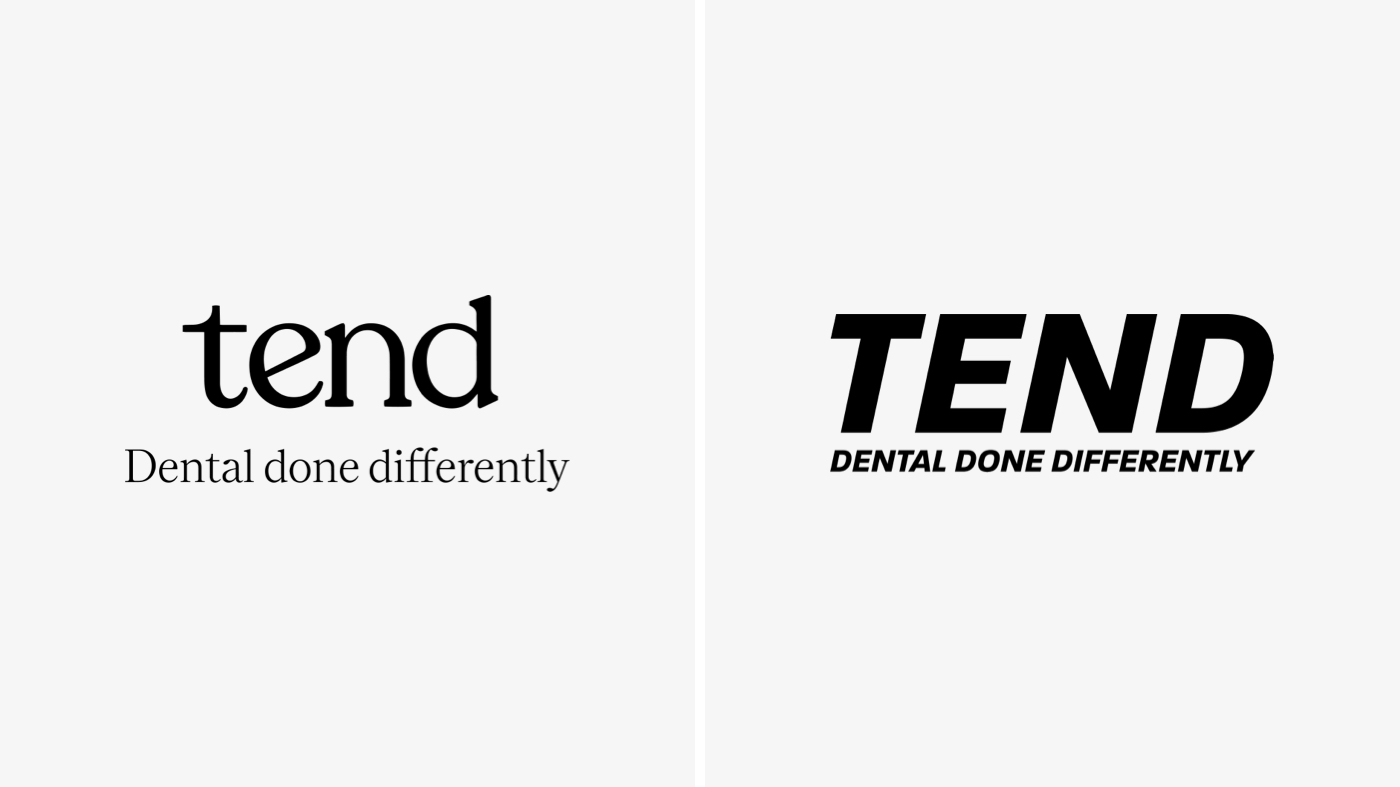
7. Select the right typeface
If you’ve ever had a visceral reaction to a font, you’ll know – typefaces have personalities. For example, a cutting-edge technology company may choose a modern sans serif font with sharp or angular letterforms, whereas a florist may select a serif font with thin, delicate letterforms.
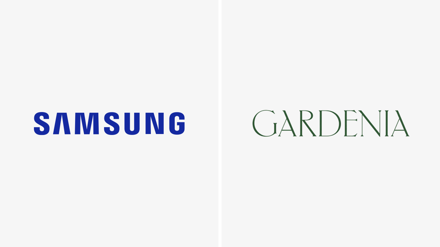
It’s vital to choose the right typeface for your logo as the personality of a given font helps telegraph what you do.
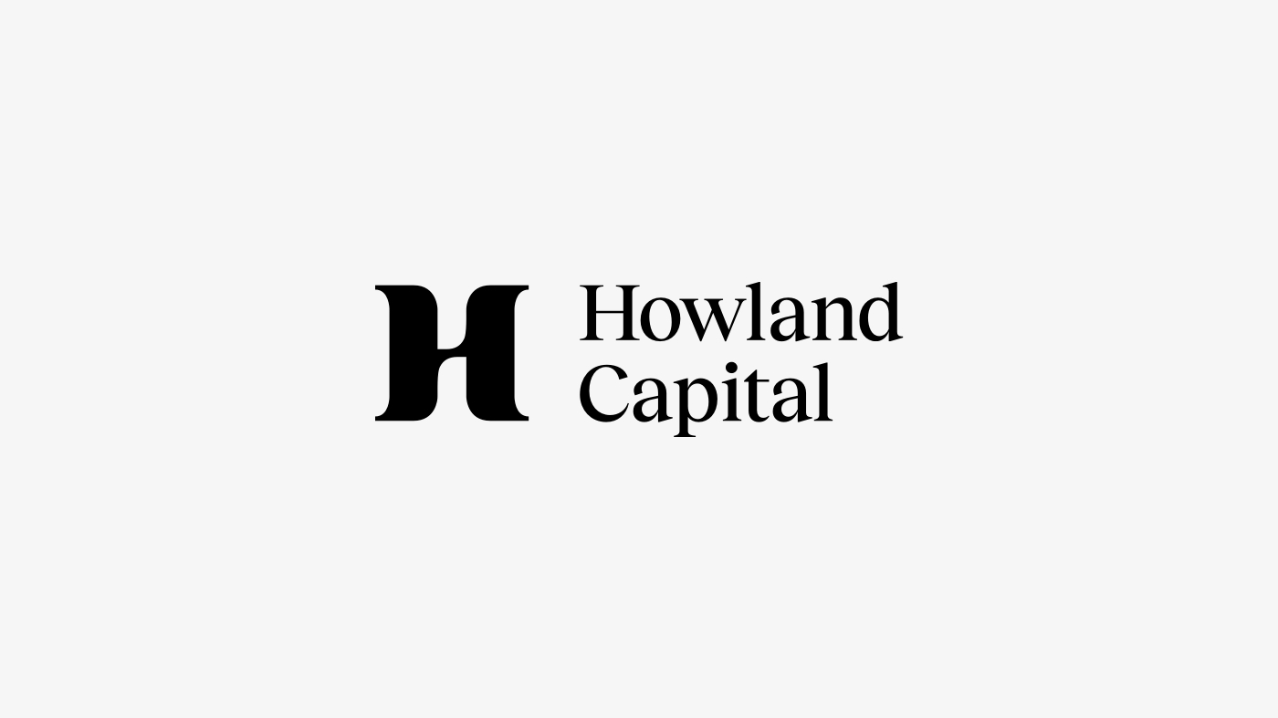
8. Decide what type of logomark is right for your brand
A logomark is an icon or graphic symbol that represents your brand and is intended to complement the name of your company (what we call the logotype). Logomarks generally come in one of two forms: literal and evocative.
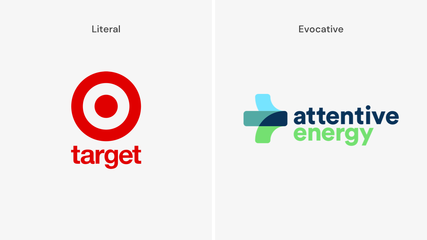
Regardless of which direction you go in, your logomark should be simple and easy to see at all sizes (more on that in a minute).
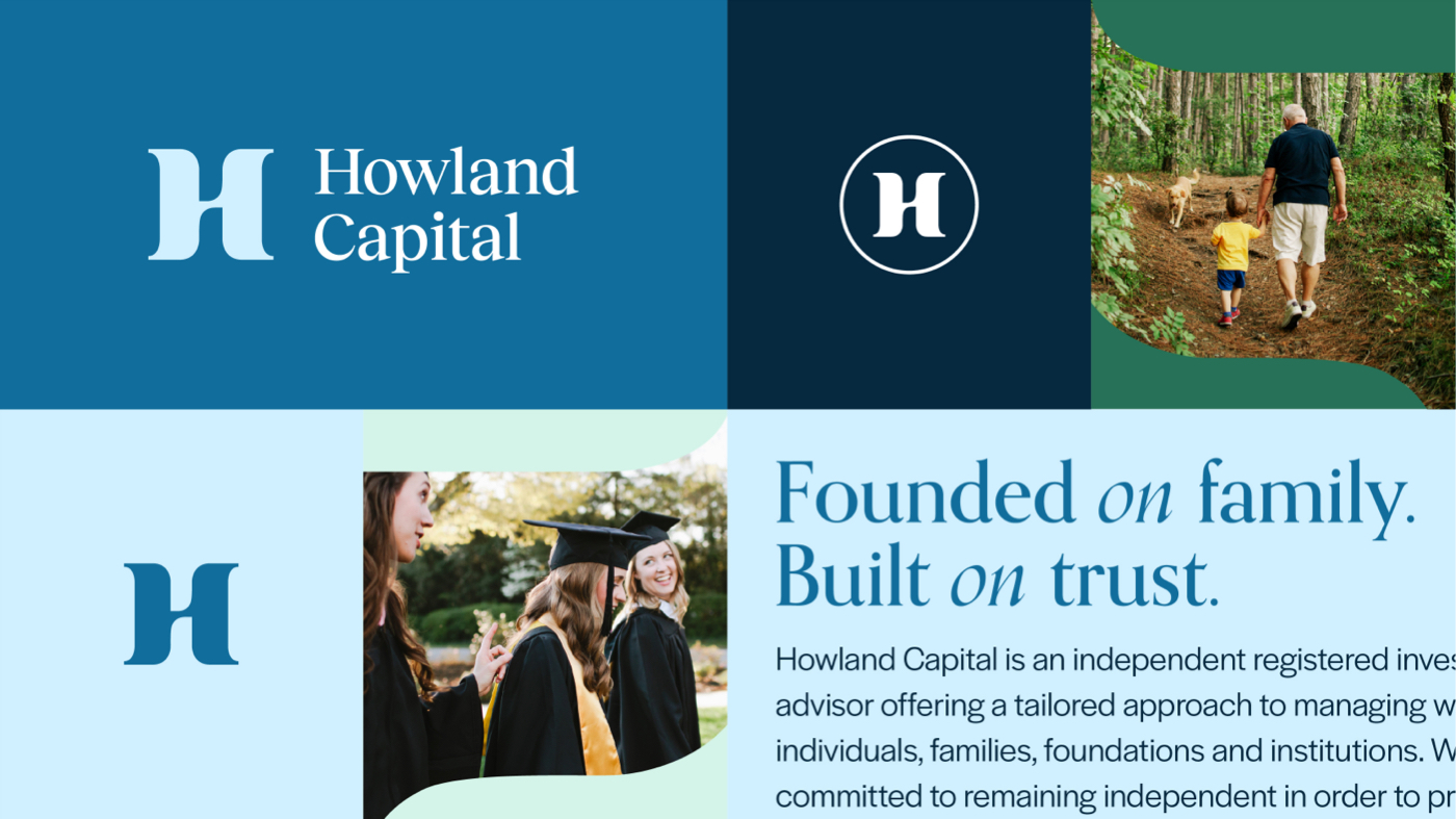
9. Ensure versatility and responsiveness
Logos are living organisms that need to adapt to different scenarios. The success of a logo depends greatly on its scalability at various sizes. From your Instagram avatar to the side of a truck, your logo must be recognizable and legible, no matter the size or context.
Legibility is most important on mobile devices, where a user’s screen size limits real estate. A complex or highly detailed logo will be rendered virtually illegible when scaled down. A responsive logo design allows you to maintain brand consistency and maximize legibility at various sizes while giving your brand the flexibility it needs to connect with your audience in as many ways as possible.
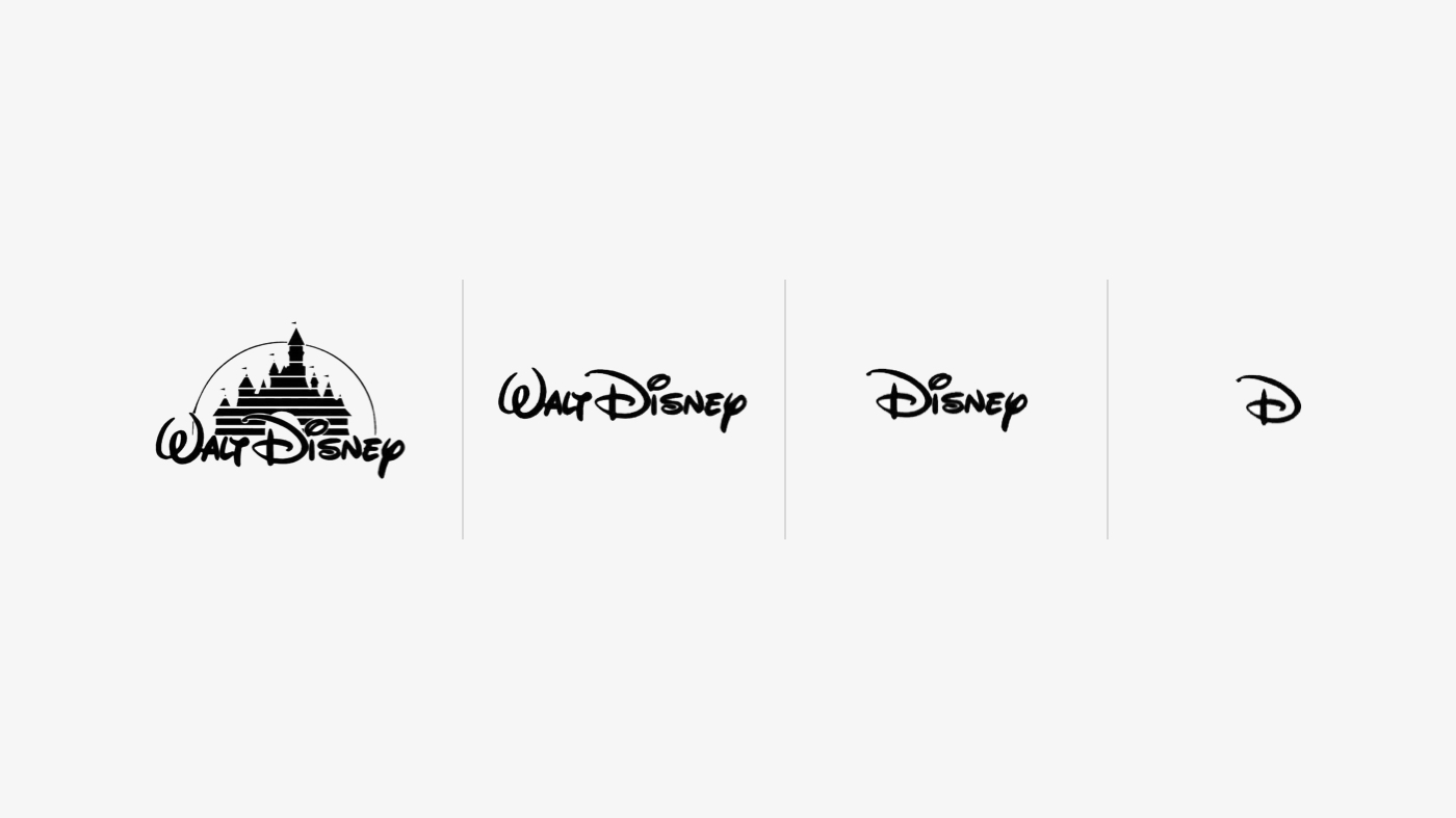
So, arm yourself with variations of your logo that will work with different sizes and formats. As the media gets smaller (think desktop monitor down to Apple Watch), the logo should become simpler and adapt to the smaller space. Words and extraneous elements should be removed without diminishing what makes your logo your logo.
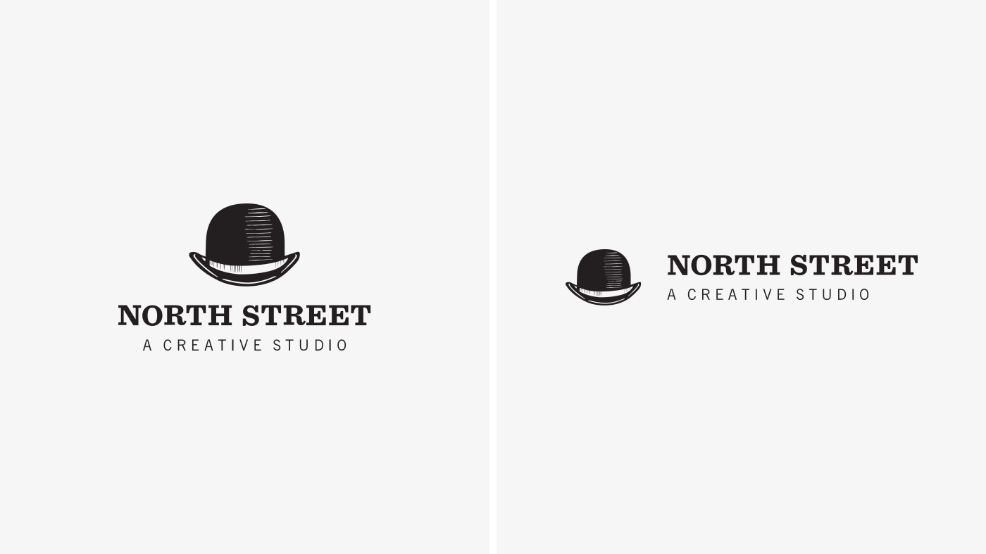
10. Include a horizontal logo lockup for your website
On most websites, the logo occupies the upper left corner of the screen. The taller the logo, the taller the header, resulting in less space on the screen for actual page content. One critical version of your logo to consider is the horizontal lockup, which reduces your header height and frees up that precious space for the contents of a page.
11. Conduct the NSFW test
In 2014, Airbnb unveiled a new logo for the brand, touting it as a “universal symbol for belonging.” The Internet felt otherwise; within a day, there was already a very NSFW Tumblr dedicated to what people thought it actually resembled. Yes…genitalia.
Before you launch your logo into the wild, continually evaluate the mark for anything that can be interpreted as inappropriate or offensive. This includes certain parts of the human anatomy and symbols with negative or questionable political connotations.
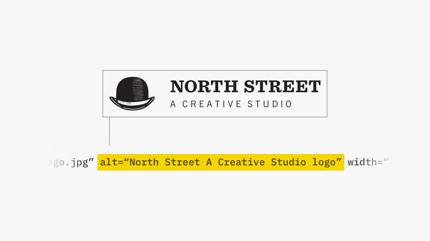
12. Ensure it meets ADA compatibility requirements
We’ve already established that legibility is critical to a successful logo. There are a handful of additional requirements to ensure your logo is visible to anyone with visual impairment challenges:
- Color Contrast: Text that is part of a logo or brand name doesn’t actually have a color contrast requirement. However, color contrast is vital to accessibility when used in digital applications. Following guidance from what’s known as the Web Content Accessibility Guidelines (WCAG), normal text requires a minimum contrast ratio of 4.5:1, and large text requires a minimum contrast ratio of 3:1. Use this tool to evaluate the color contrast of your logo.
- Alt text: Alt text, essentially short blurbs attached to images, is meant to convey the “why” of the image as it relates to the content of a document or webpage. Logos and marks may seem self-explanatory, but screen readers do not understand the difference between logos and other images. Including alt text helps visually impaired users understand what content is on the screen.
Perfect is the enemy of good
The desire for perfection often prevents excellent work. Do not get so caught up in perfecting your logo that you never actually finish it. Avoid getting trapped in the details or your fear of failure. Instead, accept a certain amount of ambiguity inherent to logo design.
You can test as much as possible, but until the logo is out in the wild, it is impossible to know with 100% certainty how it will perform.

About north street
We engineer the thoughtful transformation of great organizations. Our proven process helps us understand what your competitors are doing right — and wrong. Want to learn more? Let’s chat.