Rebranding a Financial Services Firm for the Future by Paying Tribute to its Past
Design Spotlight: Howland Capital

By Sean Tice, Creative Director
Over the past 50 years, wealth management firm Howland Capital has evolved from its roots in managing a family portfolio to a multifaceted private investment advisor. Howland’s success is largely driven by its client-centric focus; many of its relationships last for decades and carry on from one generation to the next.
North Street worked with Howland to develop a new logo and visual identity that speaks to their legacy relationships while appealing to the next generation of wealth management clients. Howland challenged us to create a visual identity that was both traditional (monogram logomark, serif typography) and approachable (warm color palette, candid and diverse imagery).
![]()
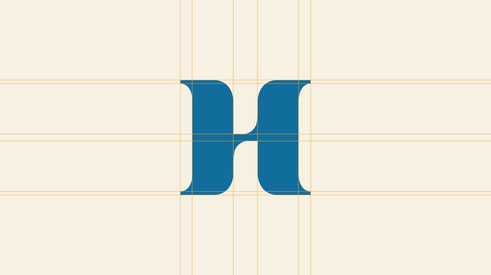
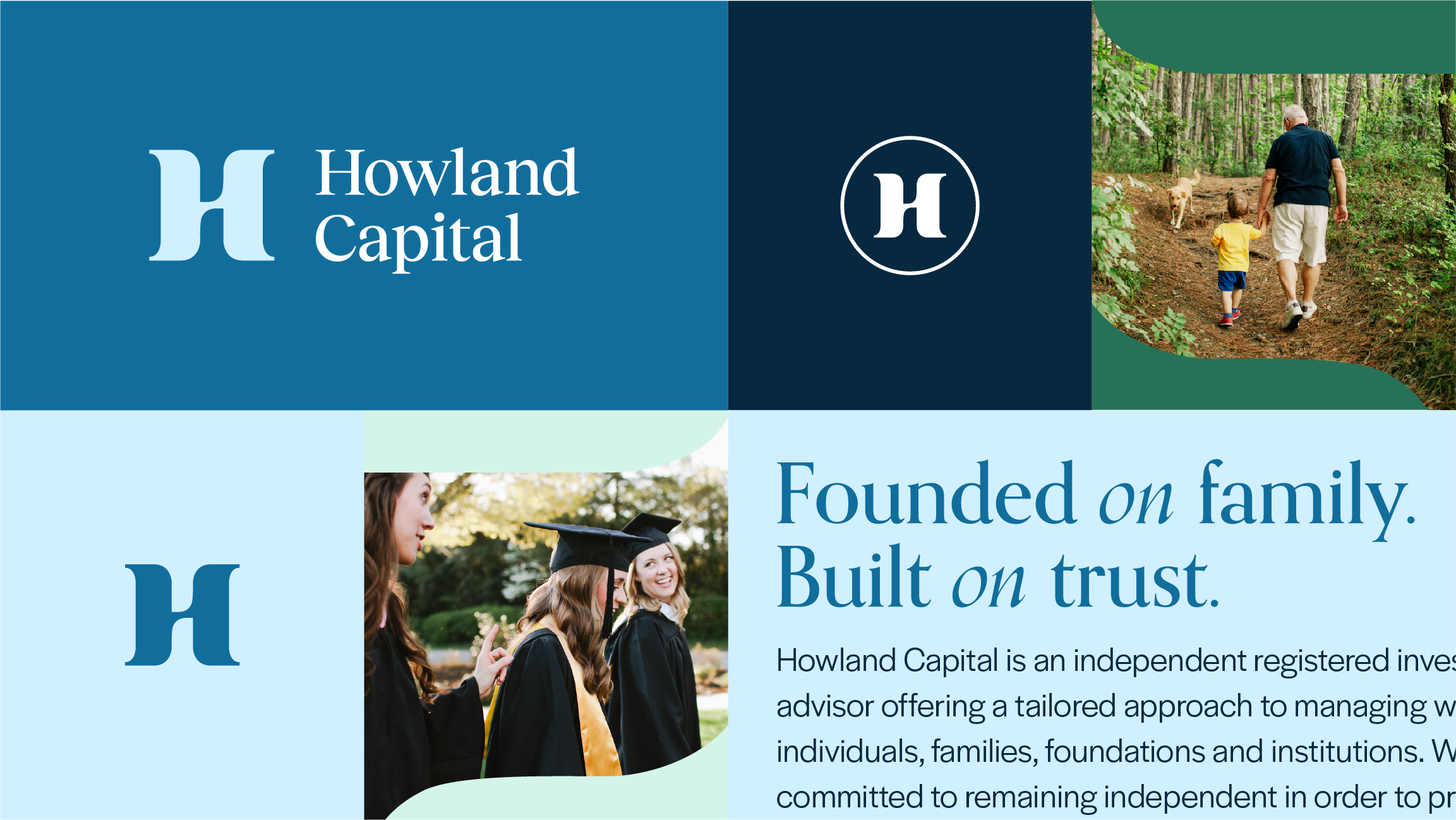
Digging into the company’s history, we discovered that the Howland family could trace its early days to the 19th-century maritime trade. This fact, coupled with the fact that Howland’s offices are situated blocks from Boston’s historic waterfront, served as a solid foundation to explore stylized “H” monograms that play off nautical motifs. Early logomark iterations focused on creating a distinctive H letterform inspired by nautical themes and visual signifiers, including ocean currents, signal flags, and boat rope.
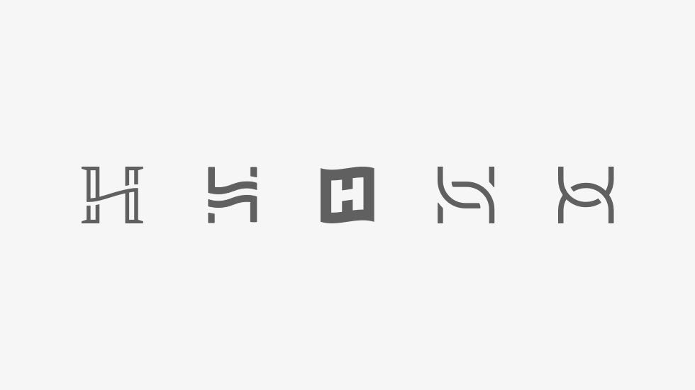
Further exploration gravitated towards incorporating whale flukes, either as a framing device for the H or as the H itself. For the logomark options on the bottom right, the H’s crossbar has been stylized to represent a subtle ocean wave. In general, nautical imagery represents wayfinding and moving forward; the finalized logomark also reflects themes of partnership, interconnectedness, balance, and harmony.
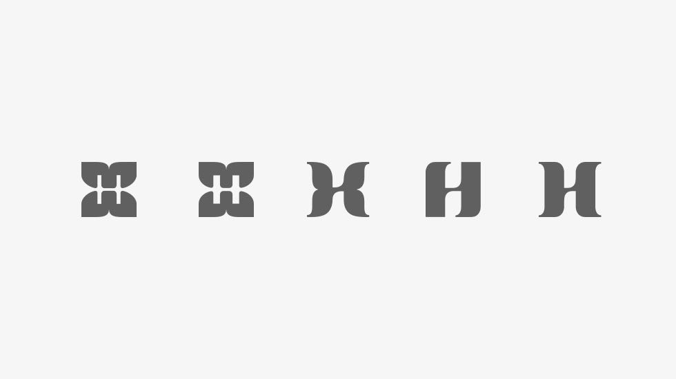
Howland wanted to differentiate themselves from their peers and appeal to a new audience while maintaining confidence and professionalism. The final mark goes beyond the traditional financial services monogram while still retaining the qualities associated with a fiduciary — trust, professionalism, and reliability.
The larger visual identity is anchored by a warm color palette and candid photos that celebrate family-centric moments (i.e., a child bonding with a grandparent) and milestones (i.e., college graduation, marriage, a home purchase). Where appropriate, the logomark can be used as a framing device for photos.

For more information about the Howland Capital website redesign, see the Howland Capital portfolio page.

About north street
We engineer the thoughtful transformation of great organizations. Our proven process helps us understand what your competitors are doing right — and wrong. Want to learn more? Let’s chat.