Our Favorite Font Pairings
By Sarah Love, Senior Designer
Much like a Cabernet Sauvignon pairs nicely with an aged cheddar, a good font combination speaks to the integrity of both typefaces and makes your messaging even more impactful. In this blog, we’ve rounded up a few of our favorite font pairings – no sommelier course necessary.
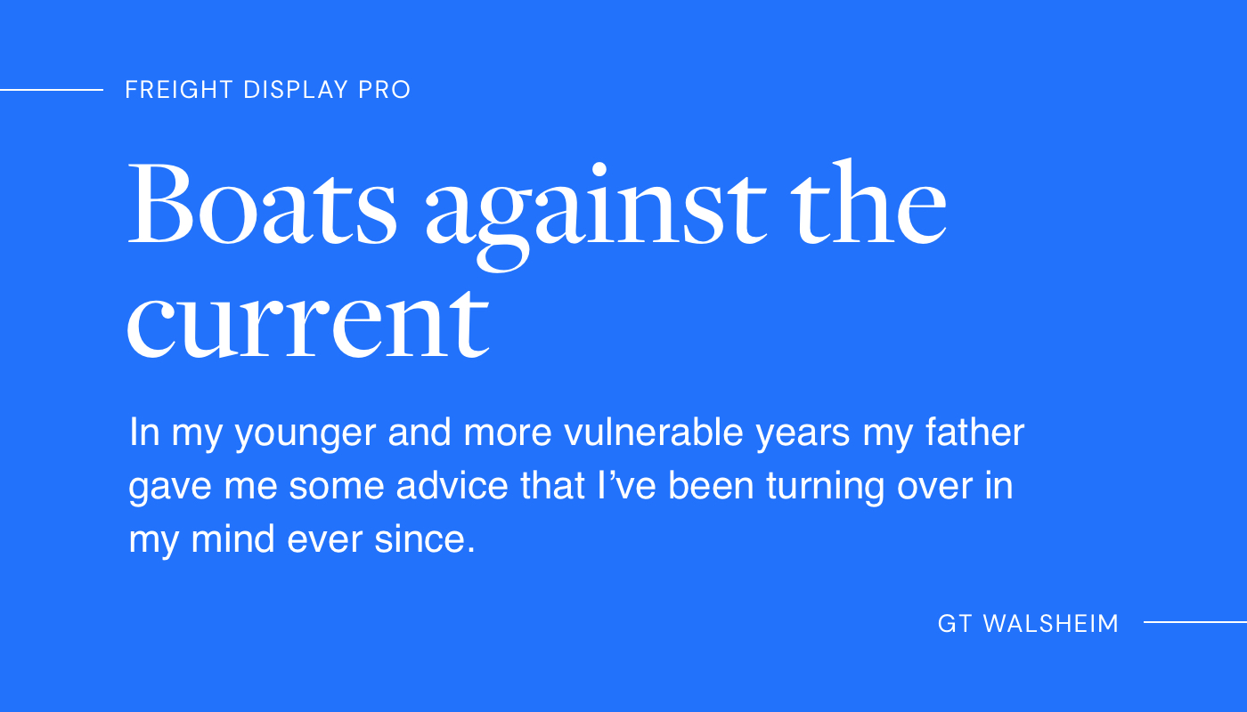
Classic
You can’t go wrong with this classic, interesting, and easy to read pairing. Freight Display is a typeface designed for display and headline usage, whereas GT Walsheim is a versatile geometric sans-serif typeface that accompanies it well as body text.
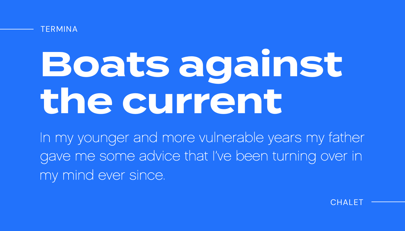
Retro
Termina breaks the norm with its generously wide letterforms, while Chalet is a clean and simple complimentary sans serif. Retro font pairings will transport your audience back to the 70’s or 80’s, and are suitable for poster, branding, and logo design concepts.
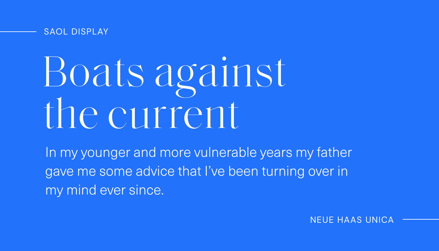
Vintage
Saol features razor-sharp serifs and high stroke contrast, giving it an elevated vintage theme. Neue Haas Unica is a neo-grotesque sans-serif typeface that is a modern revival of the long-lost Haas Unica and can be likened to the infamous Helvetica.
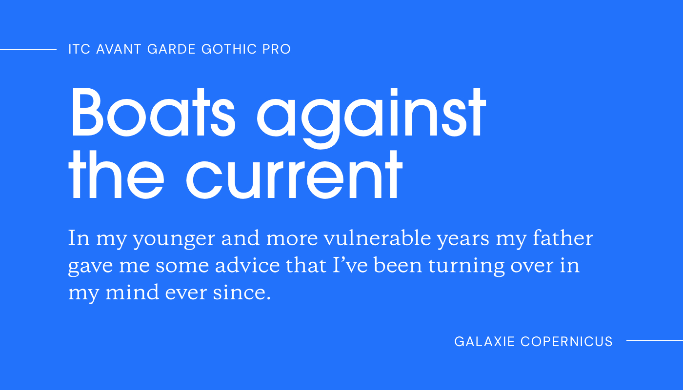
Contemporary
Famously used in the Adidas logo, Avant Garde is a stunning bold headline font. When paired with a serif like Galaxie, a perfect contemporary pairing is born.
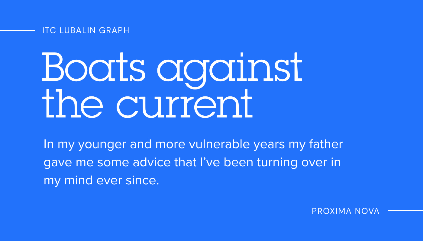
Farmhouse
A slab serif like ITC Lubalin Graph and modern geometric serif like Proxima Nova is always a good choice to convey practicality and friendliness.
For more of our favorite fonts, check out: Fonts We Love – Chapter 1 of a Zillion.

About north street
We engineer the thoughtful transformation of great organizations. Our proven process helps us understand what your competitors are doing right — and wrong. Want to learn more? Let’s chat.