The Subconscious Meaning of Colors
Plus examples to help you choose the best one for your next project.
By Matt Potter, Senior Designer
To celebrate North Street’s 12th anniversary, we’re doing a dozen blog posts all around the number 12!
Colors have the ability to evoke emotions and trigger certain reactions. They influence your perceptions of all types of things, from the taste of food to the effectiveness of placebos. They can influence your moods and attitudes and even trigger physiological reactions.
Whether you know it or not, your brand’s colors are telegraphing subliminal messages to your audience. Brands that understand and can harness the power of color will have a leg up on the competition because they are tapping into something deeper. Who can escape the light blue of a Tiffany & Co. box, McDonald’s iconic yellow arches, or Coca-Cola’s signature red?
Whether you want to create a new logo design or mock up a website landing page, knowing the meaning of colors and their associations will help you pick the optimal colors to tell your story.
1. Red
Red has meanings on two different ends of the human emotional spectrum. It can symbolize passion, strength, and love. But it’s not all hugs and kisses. Red is also a symbol of wrath and danger. A literal stop sign. While red can be positive or negative, it’s definitely the color of action. Red is an attention-demanding color that spurs people into action – whether it’s towards a target or away from a risky situation.
You can use red to draw attention to important elements, like in this design we did for Urban Conversions. You can also use it in software UI design to warn the user about making an irreversible decision.

2. Yellow
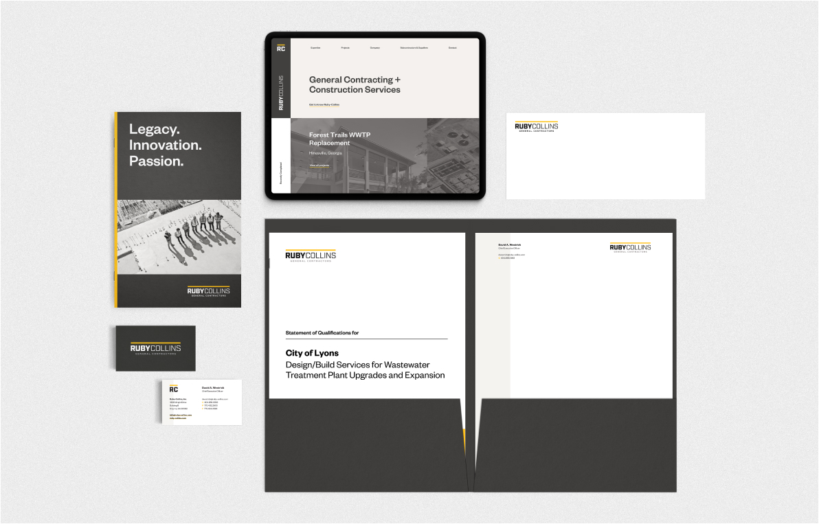
The color of sunshine and sunflowers, yellow brings about positive feelings. Joy, happiness, optimism, and hope are all within yellow’s domain. It can boost confidence and curiosity, and even improve learning. There’s just something about yellow that makes us think logically and positively. We love using yellow as an accent color to grab attention, like in this brand refresh for Ruby Collins.
At the same time, though, yellow can cause anxious and uncomfortable feelings. Both warning signs and some potentially dangerous animals use yellow to tell you to keep your distance. Use too much yellow and your design can become unnerving.
3. Blue
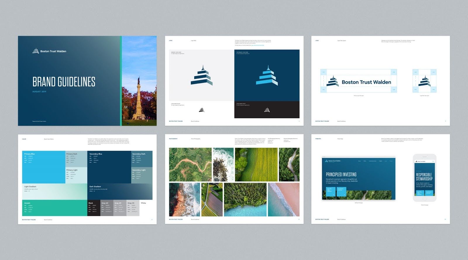
There’s a good reason why most people say blue is their favorite color — it’s calming, soothing, and symbolizes the positive. Bright blues inspire ideas of loyalty, confidence, security, and reliable authority. Many companies and brands – e.g. Howland Capital, US Assure, Boston Trust Walden – use these shades in their logos and messaging precisely because of these associations. Confidence, security, and authority are exactly why blue dominates financial services branding. In recent years, blue has also come to dominate the tech industry.
As the color of the sky and the sea, blue is also used to imply a connection to nature. The turquoise shades you might see in tropical waters not only calm people but can also energize them. Light sky blue can make people feel contemplative and serene.
You can have too much of a good thing, though. A primarily blue design can seem cold and impersonal. It can also be associated with sadness or depression. When designing, always think twice about how much and which shades of blue you use.
4. Orange
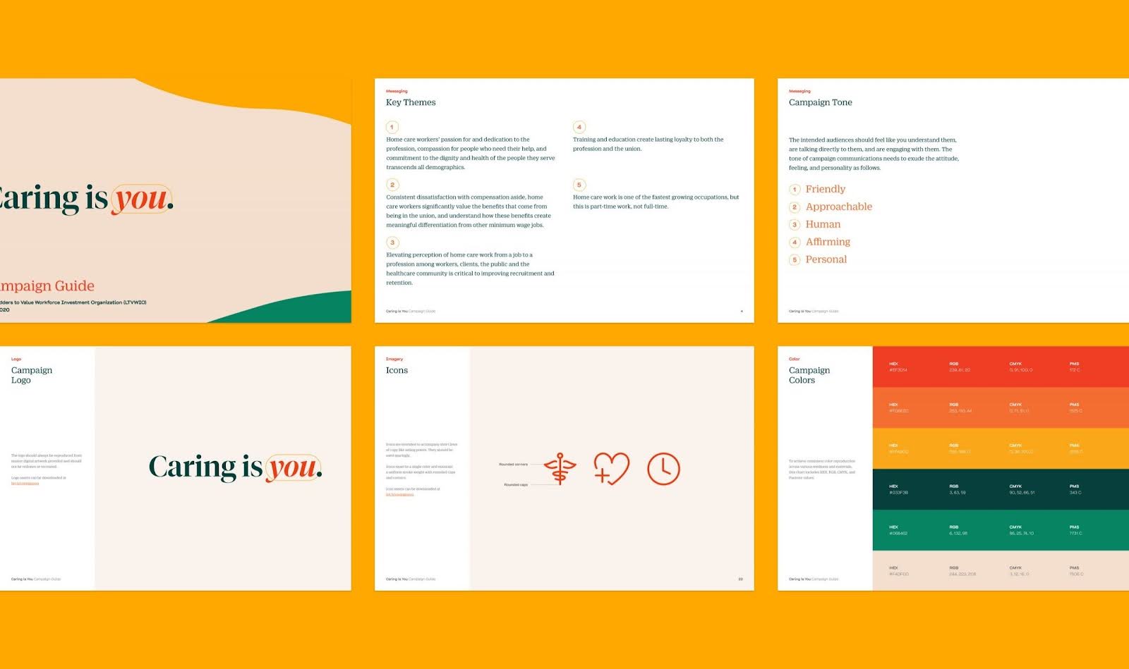
Orange is the color of positive, cheerful energy – often associated with youth, vitality, friendliness, and casualness. A mix of red and yellow, orange combines the fierceness of the former with the cheerfulness of the latter. Bright and vibrant oranges are fun colors that burst with youthfulness, energy, and happiness. They inspire creativity and uplift people’s moods. Golden oranges also exude a sense of luxury and prestige. We used these colors for the Ladders to Value “Caring is You” campaign in order to devise a visual language rooted in warmth and empathy.
Bright orange can elicit feelings of impatience. On the other hand, dark and almost brown, drab oranges — like decomposing autumn leaves — can elicit feelings of deceit or hopelessness. Overwhelmingly orange designs can be perceived as almost self-aggrandizing. It’s best to use orange sparingly to direct attention to where it matters the most.
5. Green
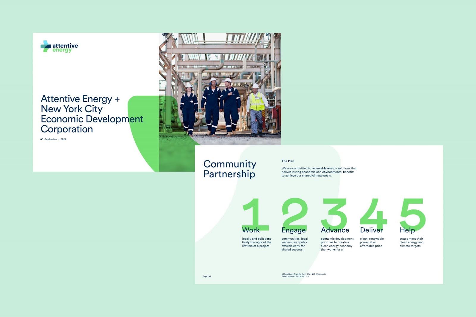
Green can be calming, energizing, and motivating. Green is among the most versatile and multipurpose colors on the color wheel. It’s everywhere around us — in plants, money, foods, and even traffic lights. There’s a biological reason as well; the human eye can see more shades of green than any other color. It’s a calming color that makes people feel safe and comfortable. Associated with nature and positivity, green can also inspire feelings of harmony, growth, safety, and success. Green was a natural fit when crafting the logo and visual identity for Attentive Energy, a newly launched venture developing offshore wind farms.
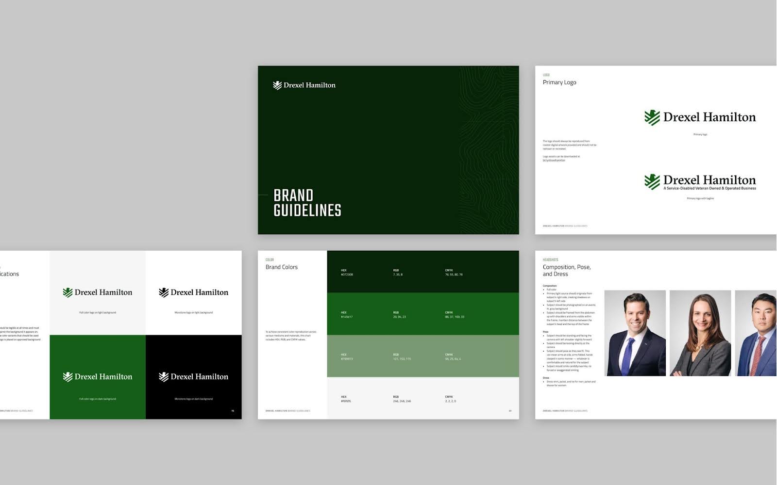
Although Green is universally associated with nature and the environment, the color also has a paradoxical meaning as it is also associated with money and greed. Darker shades of green, in particular, can imply wealth and finance; Drexel Hamilton and Pensions & Investments are both great examples of using this dark green effectively in financial services branding.
This is an example of the various shades of eliciting their own associations. Bright greens are energizing and sporty. More subdued tones, together with brown, can make people think of the Earth and nature. Yellow-green shades can make people think of sickness or jealousy.
6. Purple
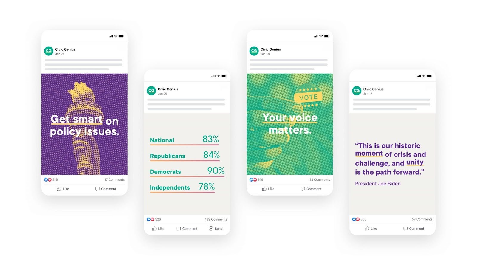
Purple blends the stability of blue with the energy of red and is often associated with imagination, idealism, mystery, magic, luxury, and extravagance. Purple’s association with royalty and luxury is due to the fact that purple is a rare color in nature, and for the longest time, purple dyes were extremely difficult and expensive to produce. As a result, only the wealthiest and most powerful people could afford it. To this day, we think of purple as the color of royalty and luxury. Consequently, it brings up a feeling of trust and reliability. This is one reason we used purple as an accent color for the non-partisan organization Civic Genius.
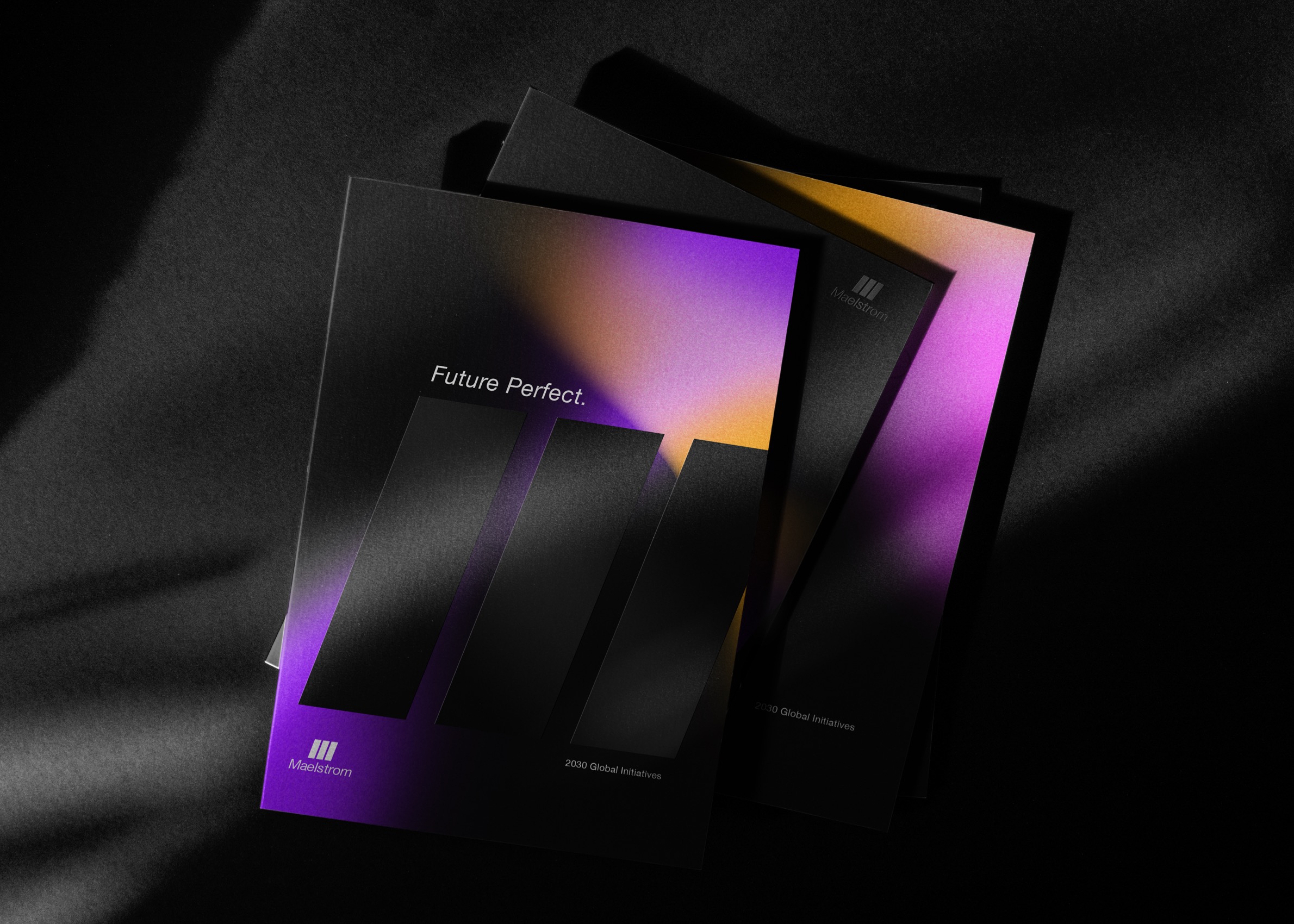
Purple’s rarity also gives it an air of mystery. It’s associated with creativity and the realm of fantasy — think about how many times magic gets portrayed as purple in popular culture. Purple can also be an inspirational color that sparks the imagination and encourages us to try new things. Our logo + branding work for Maelstrom is an excellent example of using purple accents to convey a sense of future-looking imagination and creativity for a FinTech company.
7. Pink
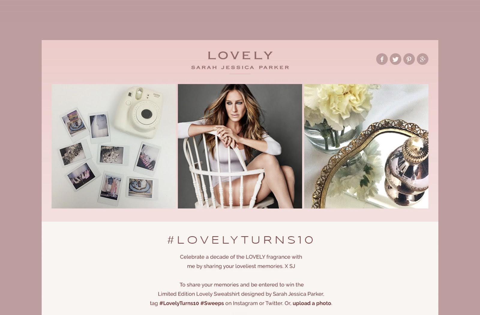
Pink is a color of opposites since it can make us think of both innocence and burning passion. Soft and pastel pinks inspire feelings of kindness and compassion. Pink is a nurturing, playful, and nostalgic color that takes people back to their childhoods. Soft pinks can make for good main choices in a color scheme when you want to calm your audience and create a sense of warmth. It will surprise absolutely no one that pink featured prominently in our microsite design for the anniversary edition of Sarah Jessica Parker’s fragrance.
Bright and hot pinks are associated with love, romance, and even lust. Intense pinks create a sense of urgency. Hot pinks are best used as accent or spot colors to catch people’s attention and inspire them to action. Because it has white mixed into it, though, pink doesn’t inspire the same kind of aggressive action as red.
Pink also shares a trait with yellow — it’s associated with childishness and immaturity. Due to its modern, stereotypically feminine associations, pink can also unfairly make people think something is too emotional and timid.
8. Brown
The color of earth, wood, and many elements of our everyday surroundings, brown is usually perceived as neutral and natural. Because of this, brown is thought to evoke feelings of warmth, security, and earthiness. While some people may consider brown to be dull, it is actually a versatile color packed full of meaning. Brown does a fantastic job of conveying emotions related to the natural world, as well as connoting organic, wholesome feelings in general. The color Brown represents steadfastness, simplicity, and dependability. The visual identity for Ross Built Custom Homes features brown in order to emphasize its connection to wood and quality craftsmanship.

Fun fact: brown also stimulates appetite.
9. Black
Black is the darkest color of the spectrum – indicative of the absence of color or the complete absorption of physical light. Historically, the color black has been used to represent mourning, sadness, and darkness. However, black can also symbolize power and elegance.

In design terms, it is typically a color that brings gravity and strength to a message. In the Cole Schotz design, the use of black adds an air of strength to the law firm as a whole and highlights its tagline. When used in small doses, black can make a design look polished, edgy, and minimalist. The colors that go with black are endless, as its versatility allows it to be paired with a variety of colors both as either a highlight or a background. Too much black, though, can easily make a design seem too dark or heavy — a careful balance is required for the right look.
10. White
The color white often evokes ideas of purity, simplicity, and cleanliness. Typically, white serves as a background to provide ample breathing room on a page or a platform to prevent overcrowding. White can represent a natural, clean slate that helps to provide contrast, focus attention on specific elements, and prevent a cluttered-looking design. For all of these reasons, white was the natural choice for our brand work on organic laundry company The Simply Co.
![]()
11. Gray
Being neither stark white nor imposing black, gray is ambiguous and impartial. It is the ultimate middle ground – a truly neutral shade. Gray is timeless and versatile. These factors make it an excellent color for legal services projects, like the Jones Jones website. Gray is often used as a secondary color or an accent color to direct attention elsewhere. Unlike most colors, gray can be used with almost any other color as a complementary background. However, overpowering gray colors can end up being perceived as drab, dreary, or boring.

12. Gold
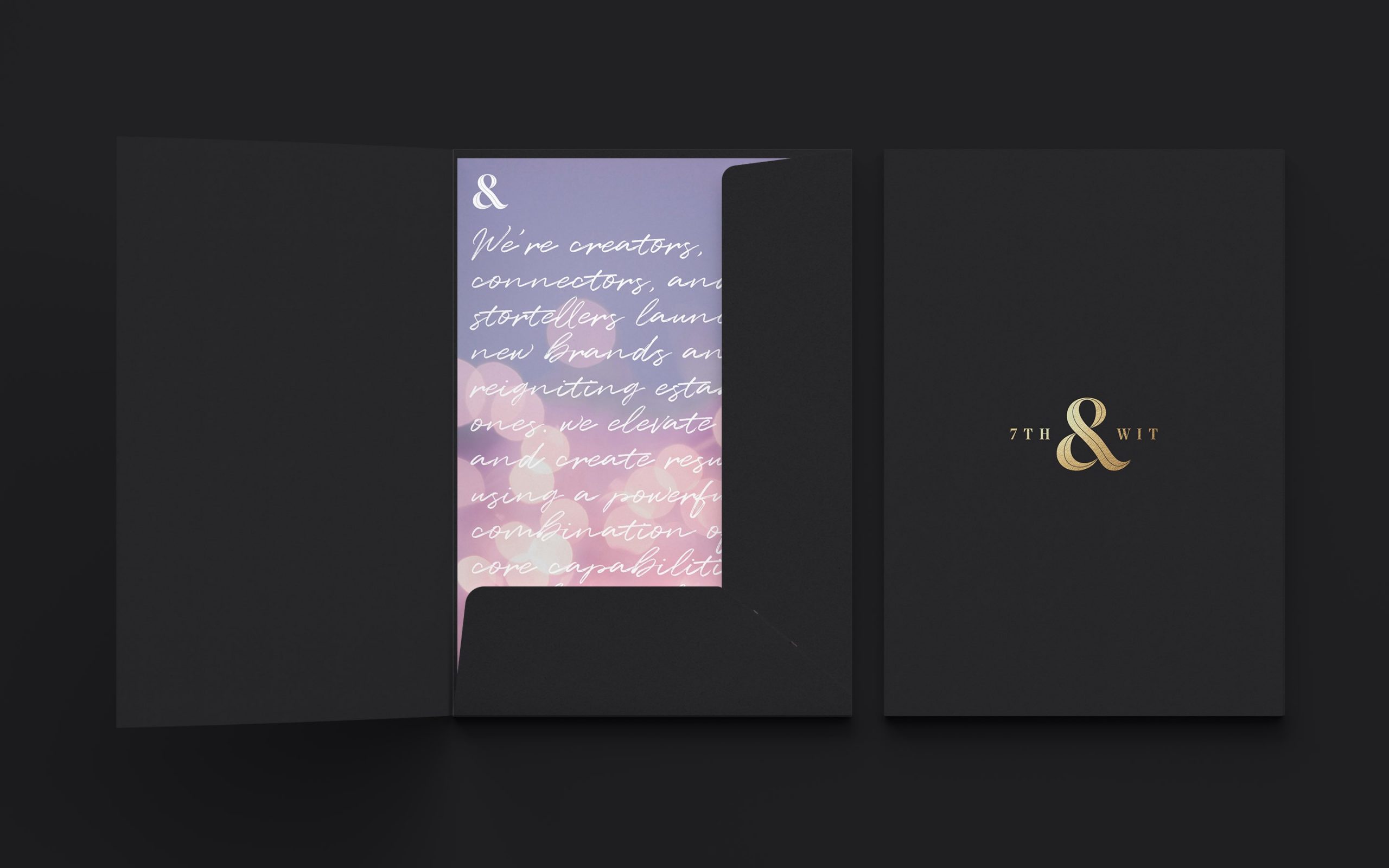
Named after the precious metal, gold is associated with luxury, success, achievement, triumph, royalty, and fortune. Gold is a multifaceted color, often denoting generosity and compassion, as well as being synonymous with divinity and power in many religious settings. Color psychology teaches us that the color gold tells a success story, making gold an optimistic and lucky color. Gold touches brought sophistication to the brand identity of 7th & Wit, an upstart digital and social strategy agency.
As you can see, there is a lot of nuance within each color; shade and pairing can matter just as much. It is also important to note that different cultures ascribe different meanings to colors, so make sure to bear in mind who your audience will be.

About north street
We engineer the thoughtful transformation of great organizations. Our proven process helps us understand what your competitors are doing right — and wrong. Want to learn more? Let’s chat.